Next season we need a 20th anniversary play off final away kit

Other noteworthy away designs have been all white with or without one red and one black (or blue) diagonal stripes, and several all black kits. Yellow has also been used on several occasions, and is “fondly” remembered for the 1999 2nd Div. play off final win against Gillingham. The use of black can in some ways point back to the roots of West Gorton, but black and yellow in combination is also inspired by the bees in the Manchester Coat of Arms which symbolises industry.
Horrid kit - colours picked at random - no association with the club- leave well alone. If we want an old kit - blue with the sash please.
 
Er; no. Just because we've had some dreadful away kits since '99 doesn't make that monstrosity any better. And as for justification, do we really need to be celebrating getting out of the real third division?

Yes, absolutely. You can celebrate out of joy and relief. I see nothing wrong with acknowledging that day/year. As for the aesthetics; definitely better than most of the recent third kits.
 
Yes, absolutely. You can celebrate out of joy and relief. I see nothing wrong with acknowledging that day/year. As for the aesthetics; definitely better than most of the recent third kits.
We'll agree to differ then, at least on celebrating that day with a commemorative kit. As for it being better than some of the recent horror shows, that is the ultimate definition of damning with faint praise!
 
We'll agree to differ then, at least on celebrating that day with a commemorative kit. As for it being better than some of the recent horror shows, that is the ultimate definition of damning with faint praise!

third kits should be like that though. Home and away traditional and then the third kit for 12 year olds. This year's is rather dull and you'd wonder who'd buy it when the home and away are fairly tidy.
 
"It's a shit kit" - We've had some bloody awful sky blue home kits. It doesn't mean we can't have a good sky blue home kit.

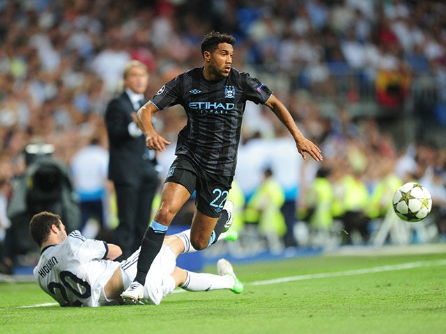
People need to remember that it wouldn't need to be an exact copy. I'd smarten it up and have it with dark shorts and dark socks, rather than the fluorescent socks the original had. A shirt similar to the 12/13 striped away were wore in Europe, but with the '99 colours.

Look at the below pic and image that shirt in the '99 colours, with dark shorts, dark socks with fluorescent turnovers. It would look miles nicer than the '99 effort.

ClichyHiguain_20120918.jpg


The kit might have been worn during darker times, but it was also worn during arguably the most important game in the history of the club, and one of the most defining and game changing moments. We also only ever lost one game in it from what I re-call!
 
Last edited:
I was just a kid at the time, loved the kit then. Went off it as I got older, but nowadays sentiment endears it to me. I wouldn't trust Nike (yes we have one season left on the deal with them) to produce a fitting tribute to that kit, so best to swerve it.
 
I was just a kid at the time, loved the kit then. Went off it as I got older, but nowadays sentiment endears it to me. I wouldn't trust Nike (yes we have one season left on the deal with them) to produce a fitting tribute to that kit, so best to swerve it.

This is the final season with Nike.
 
50 years since the 69 cup final, so hopefully a return to red and black stripes
I agree, and I think the Huddersfield template is a good one for an updated version of that shirt!

Indeed, a recreation of the plain sky blue with white collar and cuffs for the home shirt, the red & black as the away kit, and a similar homage to the ‘99 shirt as our third kit would be a PERFECT start to our relationship with Puma!

Geekin, where r u, lad?
 

Don't have an account? Register now and see fewer ads!

SIGN UP
Back
Top
  AdBlock Detected
Bluemoon relies on advertising to pay our hosting fees. Please support the site by disabling your ad blocking software to help keep the forum sustainable. Thanks.