D
D
You are using an out of date browser. It may not display this or other websites correctly.
You should upgrade or use an alternative browser.
You should upgrade or use an alternative browser.
New Kits 2018/19
- Thread starter MAG
- Start date
Sir Joe Aguero
Well-Known Member
- Joined
- 9 Feb 2012
- Messages
- 3,439
Another image ... the spikes on all sleeves, but perhaps more subtle in these which is more likely ... but just confirms Nike at their template job again for all.

Quite like the PSG one actually. Agree that our Home/Away mock-ups don't look nice at all.
dickie davies
Well-Known Member
Well I won't be buying one
Not that I bought one this season, or last, or the season before that, or the one before that
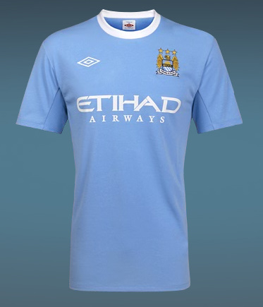
In fact you can go back to when they were clearing Umbro shirts at a tenner for the last shirt I bought

Beautiful
Not that I bought one this season, or last, or the season before that, or the one before that
In fact you can go back to when they were clearing Umbro shirts at a tenner for the last shirt I bought

Beautiful
jayfx
Well-Known Member
You spelt minging wrongLooks legit ... as Barcelona's very similar ones leaked images also floating the web ... and with Nike that spike thing seems to be their new template for all. Might look better on players with navy socks ... otherwise in pictures it's a bit meh!
dickie davies
Well-Known Member
Whatever ours are, they all would definitely be a lot better than this shit ...
Take the scum's emblem off it and the middle one is really nice as a second strip
NickyWeaverTheMagician
Well-Known Member
- Joined
- 5 Apr 2016
- Messages
- 344
I like to imagine that really Nike tried to resemble the outline of the B of the Bang on the sleeves to add a personal touch and didn't just do a template job...
In all honesty they are all horrific.
In all honesty they are all horrific.
Stockton Heath Blue
Well-Known Member
Won't be rushing out to buy any of these. Anyway, it will give me another year to diet assuming the rumours about Puma are correct!
dronefromsector7G
Well-Known Member
Taking the piss. Especially that away monstrosity.
Silvercloud
Well-Known Member
What are they supposed to be? Can't see Nike shifting many of them in their final year.
SebastianBlue
President, International Julian Alvarez Fan Club
- Joined
- 25 Jul 2009
- Messages
- 57,736
Whatever ours are, they all would definitely be a lot better than this shit ...
It’s great that United agreed to a unified Chevrolet colour scheme for their Away kit—it will allow their supporters to fully embrace and internalise what the United-Chevrolet brand partnership means...
Cellarite
Well-Known Member
- Joined
- 12 Jan 2010
- Messages
- 26,763
- Team supported
- Manchester City

I think those United ones are fake because I read the pink has been rubbished.
This is touted on footy headlines.
I won’t give my opinion just yet because in the words of Homer Simpson - “Never say anything unless you’re absolutely sure that everyone agrees.”
SebastianBlue
President, International Julian Alvarez Fan Club
- Joined
- 25 Jul 2009
- Messages
- 57,736
I won’t be buying that this year unless we win the league.
And even then it goes in the frame, along with the other trophy winning shirts.
The only ones I actually wear are the Umbro designs.
And even then it goes in the frame, along with the other trophy winning shirts.
The only ones I actually wear are the Umbro designs.
SebastianBlue
President, International Julian Alvarez Fan Club
- Joined
- 25 Jul 2009
- Messages
- 57,736
Is that design to make it is easier for the police to identify each player when they’ve been arrested for Mourinho’s murder? No shirt exchanges to confuse GMP with those unique barcodes.
I think those United ones are fake because I read the pink has been rubbished.
This is touted on footy headlines.
I won’t give my opinion just yet because in the words of Homer Simpson - “Never say anything unless you’re absolutely sure that everyone agrees.”
You’d need a fairly large reader but I imagine Amazon is on it.
Bluesince1979
Well-Known Member
Absolutely horrendous but as ive not bought a kit since i was 14 i guess it doesnt affect me. Wont stop me cheering a goal just the kits are shite ... which they completely are
nmc
Well-Known Member
Another image ... the spikes on all sleeves, but perhaps more subtle in these which is more likely ... but just confirms Nike at their template job again for all.

Looking at this shite we have gotten off lightly Look at the Chelsea kit?
OB1
Well-Known Member
Another image ... the spikes on all sleeves, but perhaps more subtle in these which is more likely ... but just confirms Nike at their template job again for all.

As others have noted, if these are legit, and it looks as though they could be, City's is far from the worst but the whole spikes template is a horrible concept. Mind you Puma, if we move there, are not beyond putting horrible designs on sleeves. Not that I've bought a football shirt for several years but I am interested in how they look and I do want the club to sell lots. TBH, football shirt designs have mostly been crap since late 60's / early 70's imo. I've always hated the patterning / texturing on the fabric that manufacturers continue to insist on. That Chelsea shirt looks like a wallpaper design - I hate wallpaper too.


