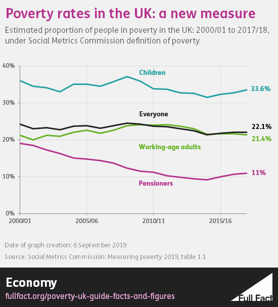
The scary thing is that the level of poverty has been pretty static for nearly 20 years (possibly more) ...
It seems, from that, that poverty improved a little during the austerity years, and I'm going to take a stab at Universal Credit being the cause of the more recent reversal around 2014/15.
However, the absolute and relative low income levels appear little changed since 2007 ...
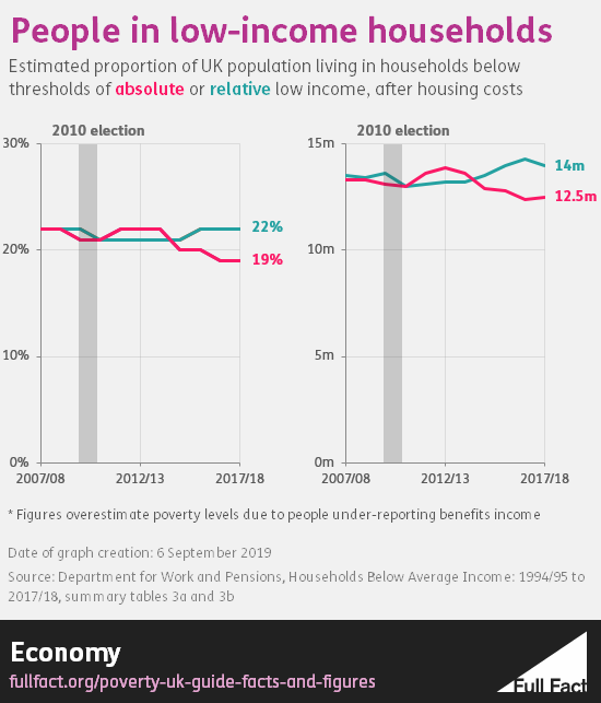
On the left, the relative calculation (blue) is static, but it is possibly misleading because it bases the low income level on average earnings, so when they rise (and generally low incomes don't) then gives a false figure because it pulls the low-income level too high making more people in poverty. The absolute level (pink) takes a fixed point and applies inflation to the low-income level. Again it's a little misleading because it ignores the salary gap, so the true point is probably somewhere between the two.
Of course any poverty is a bad thing but these charts suggest something bigger than just government policy to me. It wouldn't surprise me if there was a sudden rise in poverty following the rapid housing price rises of the nineties and early part of this century.
Wasn’t poverty redefined first and then child poverty act completely abolished in 2016 ?
https://www.google.co.uk/amp/s/amp....es-redefined-child-poverty-no-longer-finances
Last edited: