City’s New Kits - 2020/21 - [Old Thread]

  • Thread starter Thread starter MAG
  • Start date Start date


I guess we all see the shirts we first watched City in as what our kits should look like.

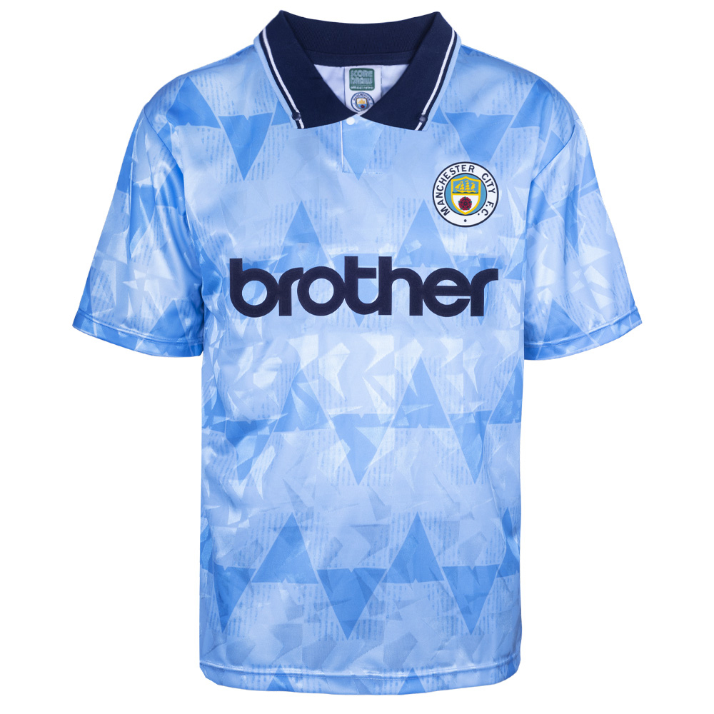
I reject this theory, because this is the first shirt I remember us wearing. ;-)

166-189.jpg


Based on that I should love the new shirt.
 
  • Like
Reactions: mat
As an old bastard, 2011 cup winning kit was fine, and red and black stripes away always worked well. Everything else in living memory is shocking.
 
Not sure about that. This is the first kit I ever had but I much prefer white shorts now!

1977%20to%2078%20team%20group%20clo.jpg

For me personally, all sky blue only works if the trim is white – unlike the Nike kit we had with navy trim that made us look like Coventry!
 
Who is that pretending to be a skunk top left ?
Middle on the right looks like a dipper
The whole lot look like show waddywaddy

Top left's King Colin... the other's Kenny Clements
I hope you were taking the piss?!

Edit: Paul Power has the look of a Gallagher brother without his tash!
 
As an old bastard, 2011 cup winning kit was fine, and red and black stripes away always worked well. Everything else in living memory is shocking.

We're getting a special edition version of that from PUMA this year by the looks of things, like we got the 125th anniversary kit last year.
 

Don't have an account? Register now and see fewer ads!

SIGN UP
Back
Top