roubaixtuesday
Well-Known Member
- Joined
- 14 Dec 2019
- Messages
- 5,826
- Team supported
- City
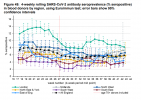
What am I missing in that graph ?
The commentary says "shows rates of new disease falling slowly below 36k", yet the numbers along the side are 20k, 40k, 60k, 80k, 100k , and the lines are for each region, and suggest the NW had over 100k cases at the beginning of November, and is still ~87k alone.
Good spot- I just looked at the trend, not the figures.
The axis says "total active cases" presumably all people with current symptoms. There'll be more people with symptoms than new cases per day, but I don't know how where the 36k comes from. Presumably people reporting symptoms for the first time?
I don't know where to find the raw data.


