D
D
Deleted member 81382
Guest
We had a couple of nice ones back to back with 2009/10 & 2010/11.
Haven't really liked any since but next season's looks like it could be a classic.
We had a couple of nice ones back to back with 2009/10 & 2010/11.
If the rumours and leaks are true, it looks like next season’s home kit is going to be better than anything we’ve seen other than the 125 YEARS special. Could even rival or better that!We had a couple of nice ones back to back with 2009/10 & 2010/11.
Haven't really liked any since but next season's looks like it could be a classic.
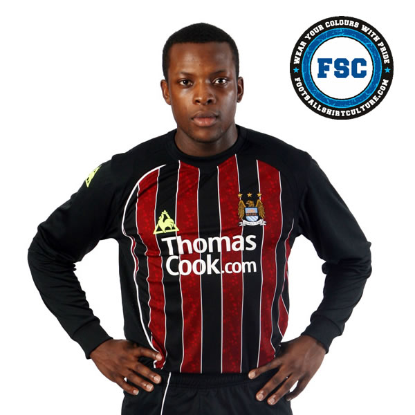
Is Bryan Gayle's erection for Dibble or the kit?The run of kits from shirts, shorts n socks between 1987 -1993 were thest best ones we have had, home away and 3rd were all great, not just as a shirt but as full kits, none since these have been exactly perfect as these were.
View attachment 42337
View attachment 42333
View attachment 42334
View attachment 42335
View attachment 42336
If this is our new shirt design, I'm 100% on board. Instant classic.I'm putting it here. We are going to lift the Prem and CL in this absolute banger next year. This years kit isn't pretty enough, hence the reason we shat the bed on Wednesday ;)

That kit is simply beautiful, it's not difficult.I'm putting it here. We are going to lift the Prem and CL in this absolute banger next year. This years kit isn't pretty enough, hence the reason we shat the bed on Wednesday ;)
That’s the worst kit we’ve ever had. Everything about it is wrong!
That’s the worst kit we’ve ever had. Everything about it is wrong!
Blimey, you started the trend with the Zebra pants!This one my dad was wearing was a beautyView attachment 42368
Get in Ned!I can think of a worse black & red one alone
[emoji23][emoji23][emoji23][emoji23][emoji23]Blimey, you started the trend with the Zebra pants!
All of them are shitI can think of a worse black & red one alone
All of them are United training tops
It was white in 87/88 and navy in 88/89. I’d guess that the sponsorship with brother which started in 87 was agreed after the kit was designed and previous sponsors logos had been always been white so Umbro assumed that would continue. Presumably brother thought navy showed up better.Love this shirt. Only thing that confuses me is that I have seen many official ones, both in match photos and for sale, where the umbro logo is navy blue. Kinda weird why some have white logos and some have blue. Anyone know why? Maybe they just used what they had in stock in those days for us because we were shit?
We’ve had worse home shirts but as an overall kit I genuinely think this is the worst we’ve ever had. It doesn’t even look like a City kit. What was even more disappointing was this was the first time the more traditional new badge was used and yet it was used on the least traditional home kit we’ve ever had.
View attachment 42304
The 2018-19 one with the weird v neck and button was worse.
Utterly fucking hideous.
Thank you so much for the knowledgeable response mate, appreciatedIt was white in 87/88 and navy in 88/89. I’d guess that the sponsorship with brother which started in 87 was agreed after the kit was designed and previous sponsors logos had been always been white so Umbro assumed that would continue. Presumably brother thought navy showed up better.
Yep. The shirt was naff but shorts and socks were the legit colours. It was also the kit for Vinny's thunderbastard and the treble, so hard to have a downer on it imo.At least it looked like a City kit.

