City’s New Kits - 2020/21 - [Old Thread]

The 3:

snip-1.png

Capture65.png

Capture84.png
Like 1 and 3 , 2 s ok. Will all look fine on players from the stand or on TV , all I’m bothered about.


Dear God what is this,looks like a quilt


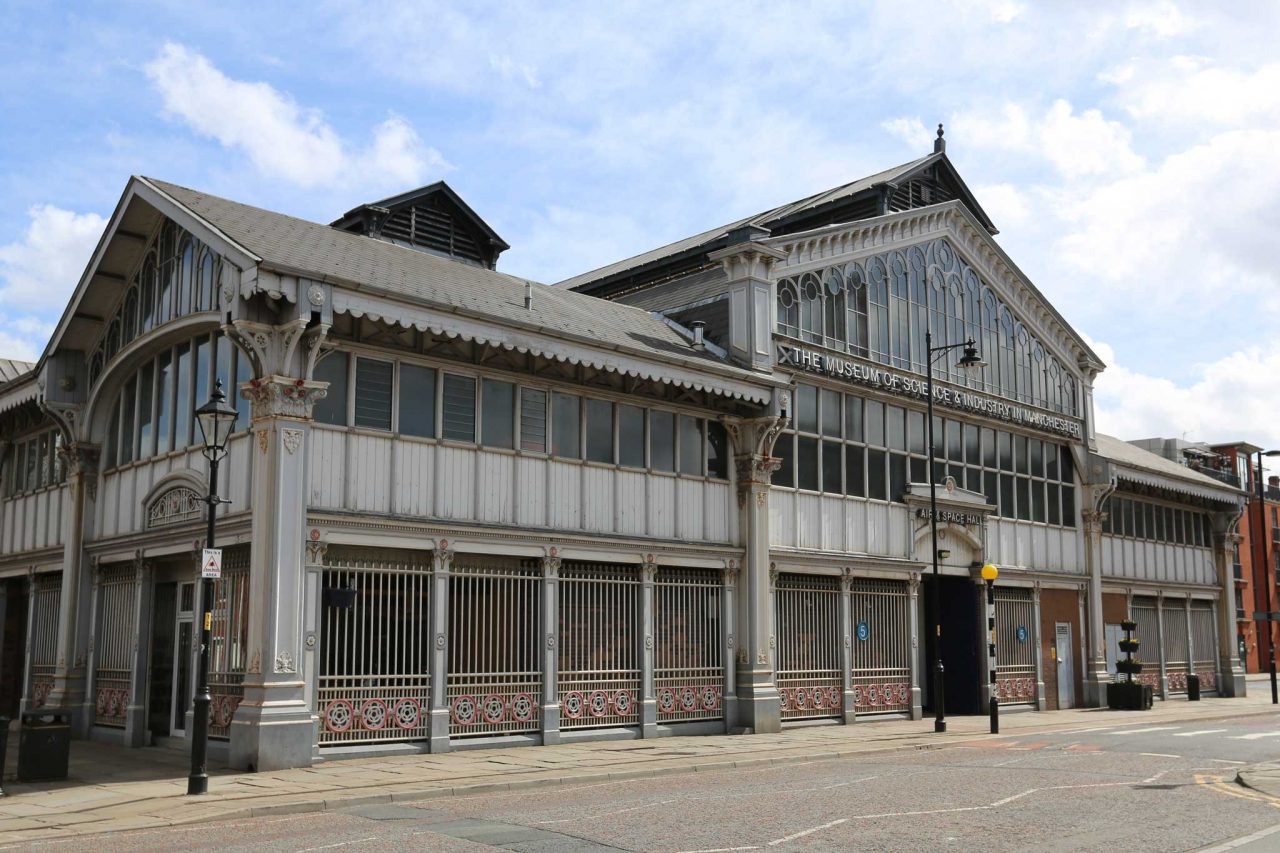
Reminds me of that god awful 14/15 blue/yellow type kit. Absolutely tragic. There was a mockup ages ago with a similar pattern on the sleeves which looked brill, that looks shite. Apparently it's a reference to old architecture in the city... much like the how the wavy pattern on this years home is a reference to the old cotton mills! Through the bloody looking glass
 
I think that's the best one. How anyone can utter the phrase "worst in history" puzzles me whilst we have played games in a Yellow and Pink/Orange monstrosity THIS season. If you don't like it, don't buy it.

The pattern is based on the museum of science and industry.
museum-science-industry-manchester-1280x853.jpg
 
"Will look good on the players" is the new "it looks smart"

Both make little, to no, sense.
 

Don't have an account? Register now and see fewer ads!

SIGN UP
Back
Top
  AdBlock Detected
Bluemoon relies on advertising to pay our hosting fees. Please support the site by disabling your ad blocking software to help keep the forum sustainable. Thanks.