FantasyIreland
Well-Known Member
- Joined
- 29 Oct 2008
- Messages
- 64,697
Loving it all......i may even part with some pennies!
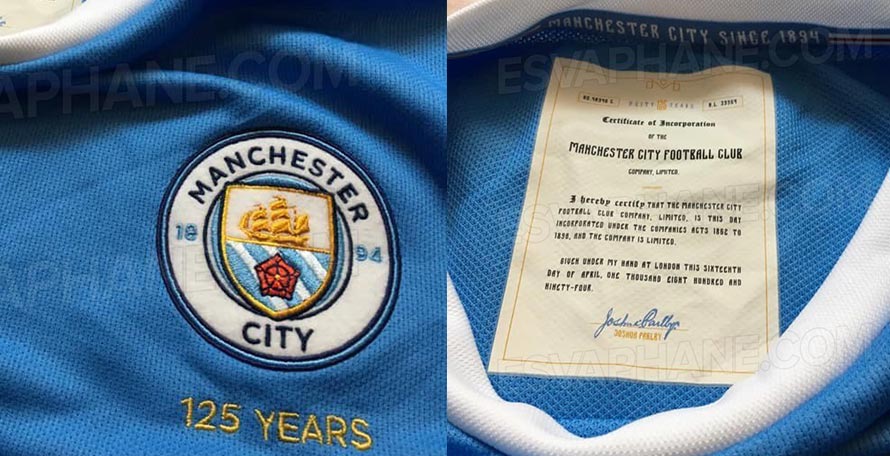
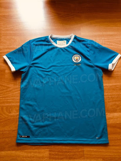
That is a thing of absolute beauty!
Ah that makes sense. Yeah I know the 60’s ones were darker than our sky blue ones, got to say I prefer the lighter colour. The Umbro brother kits were my first introduction to City, I hated the lazer blueProbably darker.
The 68 shirt even is miles darker than the shirts we have these days.
some point in july, i would guess july 1stHave the club given an official date for release yet??
West Ham like Burnley dont have purple on their shirts..???
I love this! The 125 kit is wonderful

https://www.footyheadlines.com/2019...ma-manchester-city-125th-anniversary-kit.html

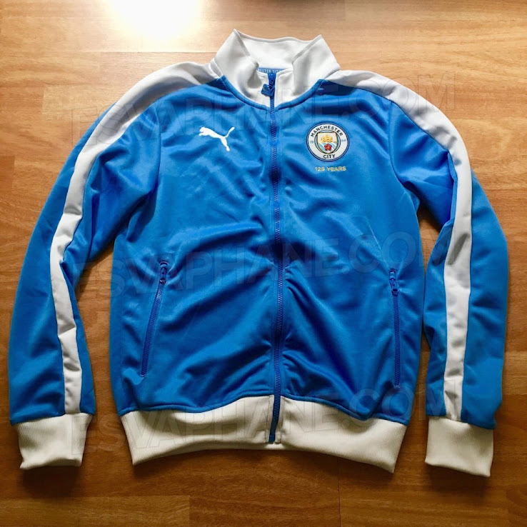
Jacket looks good too

Rather we wore that all season as it is a thing of beauty.
Two things though if being picky, we never had white trim till the 30s, so a proper reproduction on our earliest kits would be all blue, secondly would have prefered our oldest crest rather than the present one.
