DAGW
Well-Known Member
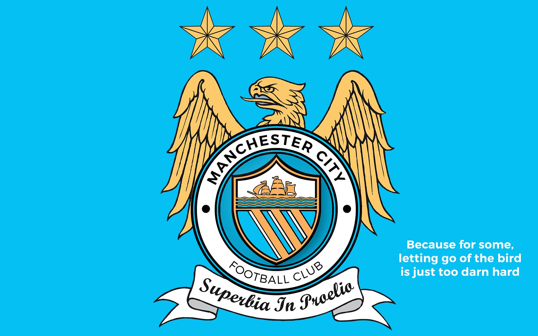
Tongue in cheek for all the twitchers out there ;)

For the people who wanted gold rivers/stripes...any takers for
I think I might have a rest for a while now...
Done my best for you mate. I'm not a graphic designer so apologies that they look amateurish.


The design is decent mate, but the shade of blue is way off! Looks more turquoise than City sky blue.

Took that colour off the website :/
Here's the design with blue moon blue ;)
Long Live The Bird!Tongue in cheek for all the twitchers out there ;)
I don't like critisicing people's efforts, but the bird is shit, it should be dead, a dead bird, decieased, no longer with us, shuffled off its mortal coil...Long Live The Bird!
Would like the badge more or less as shown but perhaps would be nice to have a nod to St. Marks represented

Instead of reposting the same general idea, as a nod to St. Marks; do either or both of the 2 flag positions below work?
The front one is more of a subtle nod, which i quite like on its own.
Oh don't get me started...If we go from the St Marks formation it's 1880.
City use 1894 for some reason and ignore the St Marks and Ardwick years.
I'm sure Gary James would know [emoji6]
Instead of reposting the same general idea, as a nod to St. Marks; do either or both of the 2 flag positions below work?
The front one is more of a subtle nod, which i quite like on its own.
The 3 rivers running through Manchester City centre, the Irk, Medlock and Irwell. Features on the Manchester City Council coat of arms, the old City badge, the old United badge and the Current FC United badge.
For me, the rose, although it looks good, is completely irrelevant to modern Manchester. Also, City draw a fair portion of support from area of Greater Manchester which have never been part of Lancs, such as Hyde and Stockport.
that shouldnt have anything to do with it imo, its manchester and that should be relevant, nothing to do with stockport or salford or places like that
Instead of reposting the same general idea, as a nod to St. Marks; do either or both of the 2 flag positions below work?
The front one is more of a subtle nod, which i quite like on its own.
Portuguese ships ...
Perfect, thanks for that. Think the top one ticks most of the boxes for me, although I think maybe for the club that text makes the name slightly difficult to read, but 2 lines of text reminds me of United's badge and 'Football Club' in full isn't really necessary (or at all according to those bastards!).
Although if I'm being picky I'd prefer the modern day ship symbol rather than the old one (thanks to the club survey I now know there is a difference!!!)
Took that colour off the website :/
Here's the design with blue moon blue ;)
I'll fetch my shoe horn again :(...
