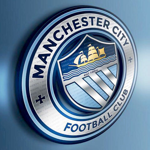
It's abysmal. Red rose looks cheap as does the ship. And no Football Club........absolute disgrace and I'll be making my feelings known at the unveiling on Boxing Day. God knows how the club have managed to get it so wrong.
You are using an out of date browser. It may not display this or other websites correctly.
You should upgrade or use an alternative browser.
You should upgrade or use an alternative browser.
Club Badge (merged)
- Thread starter MCRJON
- Start date
HelloCity
Well-Known Member
Also, **** the Lancashire Rose.
We're not even in Lancashire.
The only people who wanted that are people who wanted the old badge because it's what they grew up with.
It means nothing to young people or even those who are 30 and below. The kids of the future won't even know what it is.
We're not even in Lancashire.
The only people who wanted that are people who wanted the old badge because it's what they grew up with.
It means nothing to young people or even those who are 30 and below. The kids of the future won't even know what it is.
Well I hate the rose with a passion and probably wouldn't have like any design with it in. if this abomination is the design then whoever sanctioned it should be sacked. My first reaction was, been done by a 10 year old without a clue about desig. The club said simple and modern, nonsense The text is wrong positioning one bit straight the other concentric is poor No "football club " is wrong. I really didn't believe it could be this bad and it will offend me every time I see it. I will not purchase any thing with it on.
Would be a darn shame if it was printed on the tickets.
This all day long.........
SWP's back
Well-Known Member
- Joined
- 29 Jun 2009
- Messages
- 90,437
Beautiful.

To the moaning cunts. Ermm nothing really. You're stuck with it unless the club pulled a hell of a trolling coup on you.
Cheadle_hulmeBlue
Well-Known Member
- Joined
- 27 Oct 2012
- Messages
- 19,252
Also, **** the Lancashire Rose.
We're not even in Lancashire.
The only people who wanted that are people who wanted the old badge because it's what they grew up with.
It means nothing to young people or even those who are 30 and below. The kids of the future won't even know what it is.
are there any ships going down the canals in manchester ? most kids won't even know what the 3 rivers are
franksinatra
Well-Known Member
- Joined
- 25 Nov 2008
- Messages
- 11,129
A big thank you to all those who opted to change the club logo/badge. It looks incredible. I hope you are happy.
No problem. It is not perfect but it has the basis of a City badge.
The design was never going to suit everyone but at least its recognisable as our historical badge
kaz7
Well-Known Member
Looks worse there,the middle bit is positioned all wrong and having it in a shield really spoils it
Silva_Spell
Well-Known Member
- Joined
- 4 Oct 2014
- Messages
- 5,319
Looks a bit cartoony, I would have preferred the more traditional shield, but it looks ok. Honestly it's just a badge, it's not so wrong and outlandish as to be moaning about it.
Feed the Elk
Well-Known Member
- Joined
- 18 Sep 2009
- Messages
- 1,978
I haven't been getting involved in all the preamble to the new badge as I wasn't in favour and worried that we'd lose our identity even further, but I like it as it links nicely with the traditional badge I grew up with.
super_city_si
Well-Known Member
- Joined
- 29 Dec 2007
- Messages
- 53,457
Beautiful.
To the moaning cunts. Ermm nothing really. You're stuck with it unless the club pulled a hell of a trolling coup on you.
when put in context its much better. Looks like my tops from the eighties.
SWP's back
Well-Known Member
- Joined
- 29 Jun 2009
- Messages
- 90,437
Please print it on the tickets.Would be a darn shame if it was printed on the tickets.
Cheadle_hulmeBlue
Well-Known Member
- Joined
- 27 Oct 2012
- Messages
- 19,252

looks beautiful on a shirt
Gordyola
Well-Known Member
Would be a darn shame if it was printed on the tickets.
The ticket is a token what I actually purchase is the entry to the event I won't buy any merchandise or wear anything with it on
Stuuuuuu
Well-Known Member
It's because apparently we're all Lancastrians in spirit and damn proud of it! Even though I don't know anyone who thinks this way.The ship symbolises Manchester's trade with the world The red rose is for what?
mancityvstoke
Well-Known Member
- Joined
- 15 Apr 2009
- Messages
- 23,258
- Location
- Vintage terraced Kippax
- Team supported
- The only football team to come from Manchester
yes that does look good tbh
looks beautiful on a shirt
Can't even see the collar and the stitching is hardly straight. Plus, the sleeve is wrinkled. Feck off!
Gordyola
Well-Known Member
well they do say beauty is in the eye of the beholder
looks beautiful on a shirt