CelesteItis
Well-Known Member
That's slander. Is it okay with the CoC?Ok good for you?
That's slander. Is it okay with the CoC?Ok good for you?
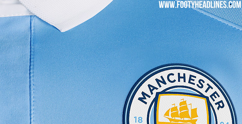
Theeeeezz!!I could live with that, but it's quite hard to ignore a big blob of red in the middle of the badge... Like a ketchup stain on a bage couch I once had..
hahahaha, its taken days for your reply mate haha, ive been waiting!! XDThat's slander. Is it okay with the CoC?
I could live with that, but it's quite hard to ignore a big blob of red in the middle of the badge... Like a ketchup stain on a bage couch I once had..
For a start..it's fucking red sauce
Secondly..that 'red stain' has been on our badge for many years
It's ketchup and that red stain hasn't been seen on our badge for what 25/30 years ??
Sorry, I may be slower than my dodgy web connection, but accusing me of being a tarquins' neighbour in the shape of a spud for not liking that red flower in the badge, is almost out of order. :)hahahaha, its taken days for your reply mate haha, ive been waiting!! XD


If you can hold on for 7 or 8 months I'll post some for you.As one of the people who didn't like the badge when we first saw it leaked on the ipo site, I have to admit the more I see it, the more I like it.
It looks like a proper City badge, but a modern interpretation. There are a few things I would change, but I can live with them. The only thing that still irks me a little but is the shield overlapping the circle. It's a minor gripe, but when you look at the other badges below, ours just looks a little bit awkward and untidy in comparison.
I remember someone asking a few pages back for a collage of how the badge looks next to other top European club badges. Just found this online, they've even gone to the trouble of drawing a red ring around ours incase anyone couldn't tell which one was the City badge ;-)
I think when you look at the PSG and Bayern badge, it makes perfect sense why they made the white circle and words so big.

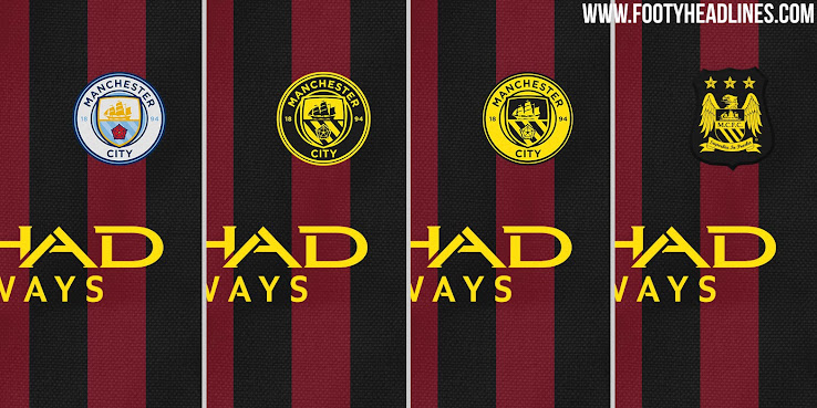
Here it is next to the other CFG badges. For me, it looks like part of the group, but certainly not a rip off, ours stands alone.
I think being on a white background really doesn't do the badge justice, it looks much better on a sky blue background, which will obviously be where we see it most anyway.
My favourite image of the new badge is on the flags though. It really just looks like the City badge, but a modern interpretation of it. I probably like it best because you can't really tell that the shield overlaps!
I'd love to see how the badge looks on our website header, properly embroidered on the kit, in monochrome on a glass door, as a solid sign on the CFA stadium, bridge, Etihad etc. On a tracksuit top that Pep is wearing ;-) etc. If @GeekinGav or any of the other design wizards have the time and inclination, I'd love to see images like that.
If you can hold on for 7 or 8 months I'll post some for you.
I think when you look at the PSG and Bayern badge, it makes perfect sense why they made the white circle and words so big.
Here it is next to the other CFG badges. For me, it looks like part of the group, but certainly not a rip off, ours stands alone.
Which one's City, mate?
In 2D on a white background is one of the few places it doesn't work which caused the consternation when it was leaked. But I think on the flag or shirt. in 3D or in monochrome then the overlapping works and in some cases enhances the badge.As one of the people who didn't like the badge when we first saw it leaked on the ipo site, I have to admit the more I see it, the more I like it.
It looks like a proper City badge, but a modern interpretation. There are a few things I would change, but I can live with them. The only thing that still irks me a little but is the shield overlapping the circle. It's a minor gripe, but when you look at the other badges below, ours just looks a little bit awkward and untidy in comparison.
I remember someone asking a few pages back for a collage of how the badge looks next to other top European club badges. Just found this online, they've even gone to the trouble of drawing a red ring around ours incase anyone couldn't tell which one was the City badge ;-)
I think when you look at the PSG and Bayern badge, it makes perfect sense why they made the white circle and words so big.
Here it is next to the other CFG badges. For me, it looks like part of the group, but certainly not a rip off, ours stands alone.
I think being on a white background really doesn't do the badge justice, it looks much better on a sky blue background, which will obviously be where we see it most anyway.
My favourite image of the new badge is on the flags though. It really just looks like the City badge, but a modern interpretation of it. I probably like it best because you can't really tell that the shield overlaps!
I'd love to see how the badge looks on our website header, properly embroidered on the kit, in monochrome on a glass door, as a solid sign on the CFA stadium, bridge, Etihad etc. On a tracksuit top that Pep is wearing ;-) etc. If @GeekinGav or any of the other design wizards have the time and inclination, I'd love to see images like that.
I thought that red circle was part of the badge design, to symbolise our empty seats and no fans?As one of the people who didn't like the badge when we first saw it leaked on the ipo site, I have to admit the more I see it, the more I like it.
It looks like a proper City badge, but a modern interpretation. There are a few things I would change, but I can live with them. The only thing that still irks me a little but is the shield overlapping the circle. It's a minor gripe, but when you look at the other badges below, ours just looks a little bit awkward and untidy in comparison.
I remember someone asking a few pages back for a collage of how the badge looks next to other top European club badges. Just found this online, they've even gone to the trouble of drawing a red ring around ours incase anyone couldn't tell which one was the City badge ;-)
I think when you look at the PSG and Bayern badge, it makes perfect sense why they made the white circle and words so big.
Here it is next to the other CFG badges. For me, it looks like part of the group, but certainly not a rip off, ours stands alone.
I think being on a white background really doesn't do the badge justice, it looks much better on a sky blue background, which will obviously be where we see it most anyway.
My favourite image of the new badge is on the flags though. It really just looks like the City badge, but a modern interpretation of it. I probably like it best because you can't really tell that the shield overlaps!
I'd love to see how the badge looks on our website header, properly embroidered on the kit, in monochrome on a glass door, as a solid sign on the CFA stadium, bridge, Etihad etc. On a tracksuit top that Pep is wearing ;-) etc. If @GeekinGav or any of the other design wizards have the time and inclination, I'd love to see images like that.
If only you'd not gone to the trouble of editing my last post to delete the bit about the red circle, you'd have a better idea ;-)

If @GeekinGav or any of the other design wizards have the time and inclination, I'd love to see images like that.
wait a few months and you can see it for real.