Why Always Ste
Well-Known Member
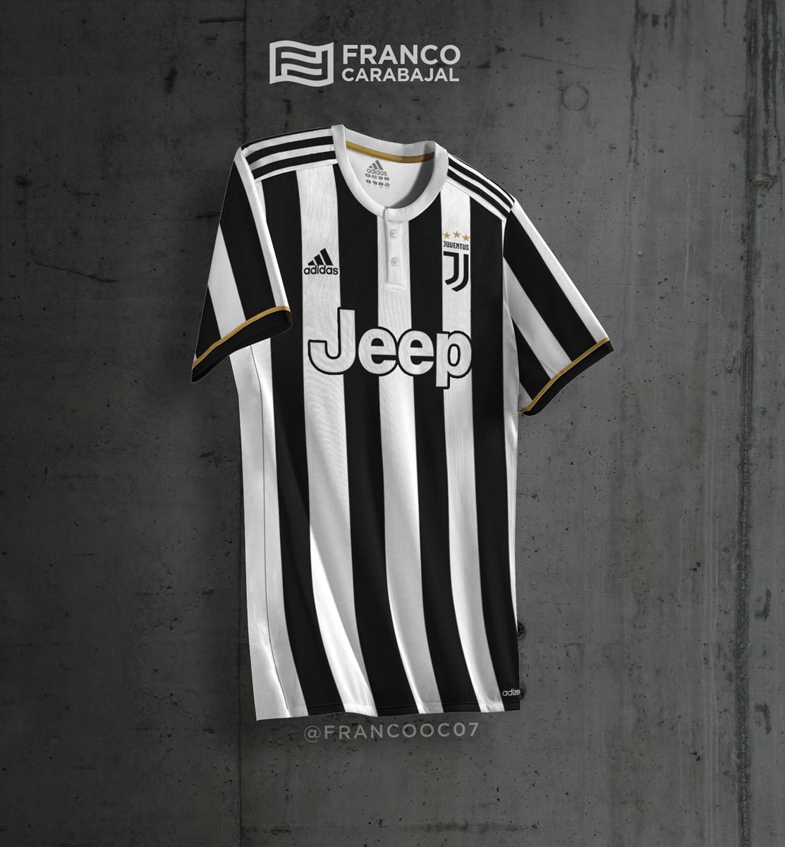
JokingWhat's the second J for?

JokingWhat's the second J for?

Erm..Glad they got rid of those ridiculous looking stars.

What's the second J for?
Its a nice shirt but I just can't associate two J's as being Juventus, no matter how much I look at it.Erm..
.
Sergio Tacchini will be turning in his grave.And to think Italians are known for their creativity/fashion.
I hear some say they were decorative; to make the badge look more continental.I bet none of their fans knew what they meant.
