Manchester City Council crest in to the future
History of Manchester's crest
To approach the problem of how Manchester's Crest should look in the twenty first century, we felt it was necessary to examine what made up the elements of the crest, where they had come from and what they actually meant. To just simplify and modernise is not enough; anything new has to have meaning and value.
Over a period of two months we examined the councils archives in Manchester Central Library. We also examined the original documentation of the granting of the city's shield in the College of Arms in London. We also felt it was essential to make an overview of what other cities employ both in the United Kingdom, but across Europe and the world.
Manchester can trace its heraldic routes back to the 13th century, when Roger de Grelley was first issued with a crest. In 1301 when Manchester was granted its first cahrter which gave its townspeople certain rights and privileges, the feudal lords the de Grelley family simply applied their own shield. This shield is described as 'Gules three bendlets enhanced or.', which simply translates as on a red shield three diagonal stripes in gold. Heraldry allows interpreation and so many variations of this can be found. A popular myth is that the three Bendlets or stripes represent the three rivers, but no historical evidence supports this view.
The significant change in Manchester's Crest happened when Manchester was granted Borough status in 1838. Four years later in 1842 the city was granted a coat of arms in two stages. The first was the adding of the ship above the shield to represent Manchester's trade links to the world. Again this does not represent a ship on the ship canal; the canal did not exist until the latter 19th century, and it rarely featured sailing ships of the kind represented in the original crest. Above the crest was placed a helmet (Helm) with ribbons (Mantle). On top of this was placed a globe and on this were placed bees, which represent industry. Below is the motto of the Borough 'Concilio et Labore'. This translates as 'wisdom and effort'. Very shortly afterwards the supporting mythical creatures were added. On the right (Heraldically) is the silver or white Heraldic antelope with a collar and chain wrapped around the body. The chain is gold and is used to represent industry. On the left is a gold lion with its face towards the viewer. On its head is a red castle; the castle may be a reference to the Roman fort at Castlefield from which the city originated. The roses upon both the lion and the antelope are references to the county of Lancashire. The Antelope and Lion are derived from the coat of arms of Henry IV (of the House of Lancaster).
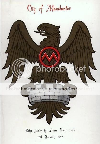
For over 120 years this description as laid out in the Borough's formations, were the basis of many different interpreations which can be seen around the city. In 1958 the first official crest was issued by the City, this included the often missed Helm and Mantling. It added in the Mantling a Golden Eagle on a Crown. The Eagle was included to represent the importance of the Aero Industry and the crowns represent the enlarging community of Manchester.
Since 1958 this manifestation has been the basis of all developments. Certain elements have been removed; the Golden Eagles have been removed, the chains on the Antelopes. Fundamentally though it represents what was described in the original 1842 charter. The problems are that in many uses now the amount of information shown is simply too great. Whilst on ceremonial examples, such as the mayors chain or architecturally it is possible and even desirable to show the entire crest, in many every day uses it neither reproduces well, nor expresses the cities forward looking approach.
As we examined all the elements of the crest we drew the conclusion that the most basic and elementary part of the design was the crest itself. This alone represents the original Manchester, but also is naturally streamlined and distinctive. Whilst heraldic elements such as the Unicorn remain important descriptive parts of the crest, they are not unique to the city. The crest and its arrangements of stripes is much more unique and distinctively Mancunian.
Such simplicity means that it can be effectively used in multiple medias at a range of sizes without losing its distinctive qualities. Whilst the complicated and elaborate crest from the 1840s will always be distinctively heritage, the crest on its own is timeless and modern.