liked, with extreme prejudice. and what about the people wearing it beside you in the stands? no purple please.It’s a strange argument saying you like it because you won’t notice the purple from a distance.
You are using an out of date browser. It may not display this or other websites correctly.
You should upgrade or use an alternative browser.
You should upgrade or use an alternative browser.
City's New Kits - 2019/20
- Thread starter MAG
- Start date
Metalartin
Well-Known Member
- Joined
- 15 Jul 2015
- Messages
- 12,443
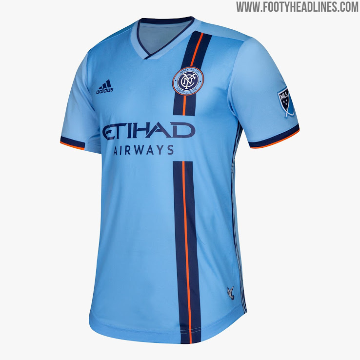
If that's true, then maybe our owner/his advisors had input on this design. In which case, it would be a bit spoilt not to allow them a bit of purple on an otherwise very nice looking kit.If that's the new home shirt i'm loving it.Would have liked a bit of white trim but it looks great. Purple color on the shirt could represent our connection with Abu (anyone but utd) Dhabi as the color Purple means Royalty & Wealth.
Bpughh
Well-Known Member
think it looks quite nice tbh
Zenmanc
Well-Known Member
- Joined
- 6 Jul 2017
- Messages
- 6,131
- Location
- Cued up at Wright's Fish & Chips
- Team supported
- The Treble Winners
Yep. If you buy the kit and wear it... It won't exactly be at a distance unless your Mr. F'ing Magoo.It’s a strange argument saying you like it because you won’t notice the purple from a distance.
thank-you, I wasn't aware of that . funny, about the end of the reebok era i sent a long heartfelt email to the club about playing in our home kit away from home and the following year we seemed to a lot. that was me, lol.I agree re playing in our home kit away from home - which we used to do quite a lot, but now we have to wear the other kits so many times under PL rules.
that on a cap and scarf would go well with Peps scruffy grey thing.
yup, no purple. i would like to learn the history of the maroon, betting it had nothing to do with money.Well, fuck it. I’ll stick my neck out.
It’s not traditional I know, but I don’t mind it.
We have some connection to maroon, and if anything that is my biggest gripe. So I can see why they have done this, but it shouldn’t be purple.
not a bad idea at all, i like it,As it’s our 125th year then what was the kit 125 years ago? Couldn’t we just have revamped that???
that kit was solid sky blue top, white shorts, navy socks, according to:
http://www.historicalkits.co.uk/Manchester_City/Manchester_City.htm
edited to add link of retro jerseys.
https://www.oldfootballshirts.com/e.../old-manchester-city-football-shirts-t11.html
Last edited:
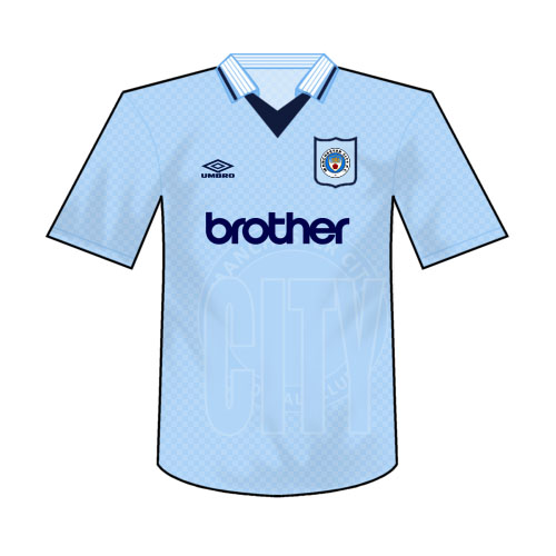
that is one nice sweater worn when we must have just signed Jesus.

Burnage Burnsy
Well-Known Member
Can you imagine the meltdown on here if we found out we were getting red white and blue socks like 1972 lol
TheThirdDeano
Well-Known Member
- Joined
- 29 Apr 2012
- Messages
- 9,117
Genuinely no idea what some of you are moaning about, I think it looks great.
Beautiful blue and a bit of eccentricity on the shoulders by introducing the colour of royalty.
Clubs evolve, and if our evolution is keeping the blue but adding purple for more distinction, personally I don’t mind.
Beautiful blue and a bit of eccentricity on the shoulders by introducing the colour of royalty.
Clubs evolve, and if our evolution is keeping the blue but adding purple for more distinction, personally I don’t mind.
Banned Tosspot
Well-Known Member
It's called personal taste.Genuinely no idea what some of you are moaning about, I think it looks great.
Beautiful blue and a bit of eccentricity on the shoulders by introducing the colour of royalty.
Clubs evolve, and if our evolution is keeping the blue but adding purple for more distinction, personally I don’t mind.
The Premier League Golden badge won't look good on them there sleeves ...
Hey hey hey calm down now, calm down. It dunt matter yous won’t be wearing them la - second is the new first they do tho don’t they tho says.
HelloCity
Well-Known Member
Can you imagine the meltdown on here if we found out we were getting red white and blue socks like 1972 lol
Apparently there was one (not on bluemoon...) when fans found out we were wearing red and black stripes for the 69 Cup final instead of maroon.
Otamendi's Beard
Well-Known Member
- Joined
- 11 Jul 2007
- Messages
- 4,436
I think it's a bit underwhelming considering it's our 125th anniversary and we've just bagged a domestic clean sweep.
The only designers that I rate are Umbro, at least they try to make it individual and unique to the club. Although Adi have done a decent job for Arsenal this year (not Leicester though).
The only designers that I rate are Umbro, at least they try to make it individual and unique to the club. Although Adi have done a decent job for Arsenal this year (not Leicester though).
For our special shirt I think we should have just gone with a plain black with the new badge on it. (Instead of the cross)
But, as mentioned many, many times – that's not a City kit
TheThirdDeano
Well-Known Member
- Joined
- 29 Apr 2012
- Messages
- 9,117
Never been a fan.It's called personal taste.
Oyster28catcher
Well-Known Member
- Joined
- 3 Jul 2010
- Messages
- 7,658
- Location
- https://acton28.blog/
- Team supported
- CITY/Aberystwyth Town
At first I detested the purple, then I liked it, and now having read everyone elses responses, I'm not too fussed. The concept of concept shirts, the way we have voted governments and a probable European election and so on, has made me cold to choice by fans - and people. In future, I hope to see those who put their concepts on computers to the designers. I hope that fans get their voice but we'll never all be satisfied.
I always remember the embossed offset word of City on a 90's Umbro kit, making me feel like the designer had one too many Two Dogs Alcoholic Lemonades. Some of our away shirts in the 90s and 00s were abysmal. I just hope that every City short we have stands put from the crowd and shows who we are. I hope that the City Football Group allows each other club to be who they are too.
Plus points for the supposed blue/purple kit:
NO CREST MOUNTED ON A SHIELD.
NOT NIKE.
NOT GLOW IN THE DARK.
NO WEIRD RIBBING, PIPING OR LINES THAT JUST DON'T SEEM TO BELONG THERE
BOLD & STRIKING.
QUITE SIMPLE.
Royal colour. I like Ribena, Cadburys chocolate and
It can also mean " a need to appear unorthodox" - typical City.
Purple in the mindest can represent, "sensitive and compassionate, understanding and supportive, thinking of others before yourself - you are the person others come to for help". I read somewhere that people may take advantage of those who like purple.
Purple is rare in a natural form.
We started the Premier League days with a purple away shirt.

Negatives: intermediate colour between red and blue; unusual in City's history. Surely maroon would have fitted better? Represents sexual frustration? Can represent priests too. Queen Elizabeth I didn't like anyone wearing it outside her family.
The 2018/19 away shirt was vile purple with orange. The 2007/08 away shirt saw how many wins? The 1992-94 away shirt wasn't exactly fashionable.


I always remember the embossed offset word of City on a 90's Umbro kit, making me feel like the designer had one too many Two Dogs Alcoholic Lemonades. Some of our away shirts in the 90s and 00s were abysmal. I just hope that every City short we have stands put from the crowd and shows who we are. I hope that the City Football Group allows each other club to be who they are too.
Plus points for the supposed blue/purple kit:
NO CREST MOUNTED ON A SHIELD.
NOT NIKE.
NOT GLOW IN THE DARK.
NO WEIRD RIBBING, PIPING OR LINES THAT JUST DON'T SEEM TO BELONG THERE
BOLD & STRIKING.
QUITE SIMPLE.
Royal colour. I like Ribena, Cadburys chocolate and
It can also mean " a need to appear unorthodox" - typical City.
Purple in the mindest can represent, "sensitive and compassionate, understanding and supportive, thinking of others before yourself - you are the person others come to for help". I read somewhere that people may take advantage of those who like purple.
Purple is rare in a natural form.
We started the Premier League days with a purple away shirt.
Negatives: intermediate colour between red and blue; unusual in City's history. Surely maroon would have fitted better? Represents sexual frustration? Can represent priests too. Queen Elizabeth I didn't like anyone wearing it outside her family.
The 2018/19 away shirt was vile purple with orange. The 2007/08 away shirt saw how many wins? The 1992-94 away shirt wasn't exactly fashionable.
Dubai Blue
Well-Known Member
- Joined
- 23 Jul 2007
- Messages
- 15,428
The purple one looks okay to me. Not great, not shit. So an improvement on some recent efforts.
The "anniversary" shirt is a proper head scratcher though. Don't get me wrong, I like it as a shirt. But we're not celebrating 125 years since 1968 so don't really get the reference.
Think they could have put a bit more effort/imagination into that one TBH.
The "anniversary" shirt is a proper head scratcher though. Don't get me wrong, I like it as a shirt. But we're not celebrating 125 years since 1968 so don't really get the reference.
Think they could have put a bit more effort/imagination into that one TBH.