COVID-19 — Coronavirus

Status
Not open for further replies.
Swansea update: (This data is two days in one remember)

Cases 280. (Last 1 day was 149). Total cases 13, 152.

Pop score 5325 up from 5212.

Weekly Pop 562. Hard to calculate up and down with the split in data. But up from about 545.

Generally doing better than a week ago.
 
Cheshire East update:

142 cases up from 91. Total cases 11, 358.

Pop score up 37 to 2957,

Weekly Pop up from 230 to 240.

Unfortunately like Stockport suffering in the same way upward. And tracking what happens in Stockport day to day quite well.
 
Cheshire East update:

142 cases up from 91. Total cases 11, 358.

Pop score up 37 to 2957,

Weekly Pop up from 230 to 240.

Unfortunately like Stockport suffering in the same way upward. And tracking what happens in Stockport day to day quite well.

Excuse my ignorance but what is a "Pop score".
 
Kent update:

Dartford

Cases 98 - down from 99. Total cases 4916.

Pop score up 86 to 4365.

Weekly Pop 894 DOWN from 961


Medway

Cases 247 - down from 285. Total cases 14, 790

Pop score up 89 to 5310

Weekly Pop 924 DOWN big from 1059
 
Excuse my ignorance but what is a "Pop score".
How science and government measure performance of the hundreds of towns and boroughs with different populations by scoring the total cases versus 100,000 POPulation. Meaning direct comparisons are possible.

The Pop Score across the whole pandemic goes up day by day unless zero cases added. The higher the worst. The more it goes up daily the worst day it has had.

In GM right now Oldham's Pop score is at 6928. It went up from 6906 - just 22 today. That is pretty good and shows it is doing well with low cases relative to its population. Not long ago it was one of the worst in the UK and running neck and neck with Blackburn. These were the two worst places in England.

Oldham has improved and improved but Blackburn has struggled. Today its POPulation score went up by 54 to 7498.

That is more than double what Oldham rose by but the cases in Blackburn were not double Oldham's.

Only by judging the two towns v 100,000 Population do their different scores reveal how each is doing in real terms.

So the POP rise every day is in many ways the key number - not the cases. As the lower this is the better anywhere is doing day to day.

Aside from the overall POP(ulation) score that always rises day to day - there is also a WEEKLY Pop - based on the same cases v 100,000 measure to allow comparison between different size places.

But the Weekly Pop only measures cases across the past 7 days so judges the rise OR fall over that period.

So the Weekly Pop can go up or down and if it is going up things are getting worse week to week as cases are escalating. And if it is going down the opposite is true and things are getting better.

Thanks for taking the time to explain HP, highly appreciated.
 
Long Covid has some strange symptoms.
I had aches and pains for 5 months and totally lost my sense of smell for 3 months. I was left with a bad asthma cough which has only got under control this month - nearly 9 months after I had it!
 
I haven't posted them in a while but will do so again over the next few days just to get a picture of how things are. @MillionMilesAway. I'll hang off for now as data is a bit all over the place as HP has pointed out, with unusually low test numbers and unusually high % positive figures, but over next few days things should hopefully sort itself out.

They're available https://www.travellingtabby.com/scotland-coronavirus-tracker/ here, that's where I get the data from. The site is legit and has been singled out for praise I believe from Devi Sridhar and possibly even the Scottish government for the work behind it.

Thank you, both you and @Healdplace

It was more a general point that case numbers as quoted per day could still do anything, and it's the age brackets that will show the effect. The presentation you give is really helpful though.
 
Wiltshire please.
I will add Wiltshire to the list but I do not think there is much to worry about.

It sits on just 6979 cases. With a very low Pop Score of 1369 (far below even the best in GM - Stockport which is 4120). This shows that across the past 9 months Wlitshire has been among the top performers in the country. Being a rural county will have helped.

It is caught in the rises around the west country of late but these are still only relative
Currently Wiltshire is on an upward track like everywhere else. But not excessively so.

It had just 79 cases today.

It had 749 cases in the past week. So that is down versus the 107 per day average. Its weekly POP score is 149, Below almost everywhere in GM.

n what I guess we have to now call the second wave that peaked mid November Wiltshire only got to 138 Weekly Pop and then fell to 67 by 7 Dec but has been rising since and at 149 is above that second wave peak.

But 149 is not anything to worry about

I cannot really track everywhere. But i will add it to the list if you wish. However, right now I do not see any reason for concern here.

It is number 293 in the 315 England boroughs and level with High Peak (Buxton etc) the only NW area that low right now. Nobody that low in the table is in any immediate problems. Though it has gone up by 61% in past few days which is quite high compared to those around it.

Remind me in a few days and I will do another review of it and if it is starting to look like it needs a daily watch then I will.
 
Last edited:
Assuming I've got this right, where I am in East London is reporting 939/100k between 14-20 Dec, with an England national average of 238.
2600 in the week, out of a complete total of 11100 in the whole year (as far as I can tell)
Deaths/100k are only just over 1/2 of the national average, with covid responsible for about 2-3 a day per 100k recently
 
MILLION MILES AWAY:-


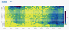
On the Gov UK website there IS a new experimental 'heat flow' chart that you can look at for any place. It charts how many people of each age range are testing positive across the past months.

It does this in age group of just 5 years.

It is very visual and relies on colour coding so best to view it for any area you wish.

I just happen to have the Wiltshire map on screen as it is in the same area of Gov Uk with the case data, of course, so I was studying Wiltshire for the poster above.

This shows that on the latest pre Christmas data the 20 - 24 age group had the highest testing positive rate at a case rate of 335 per 100,000.

But in mid May in Wiltshire the over 90s had the highest rate across the entire pandemic when they got up to 874 per 100,000.

It is impossible to summarise as this is a very visual tool and you see all 9 months and every age range in one go. But just select cases on the gov.uk site, select the local authority you want to look at and you will see the current heat map with colour coding across all the age ranges there.

Though as with most map or chart Gov UK data it only goes up to 5 or 6 days ago.
 
Last edited:
I will add Wiltshire to the list but I do not think there is much to worry about.

It sits on just 6979 cases. With a very low Pop Score of 1369 (far below even the best in GM - Stockport which is 4120). This shows that across the past 9 months Wlitshire has been among the top performers in the country. Being a rural county will have helped.

It is caught in the rises around the west country of late but these are still only relative
Currently Wiltshire is on an upward track like everywhere else. But not excessively so.

It had just 79 cases today.

It had 749 cases in the past week. So that is down versus the 107 per day average. Its weekly POP score is 149, Below almost everywhere in GM.

n what I guess we have to now call the second wave that peaked mid November Wiltshire only got to 138 Weekly Pop and then fell to 67 by 7 Dec but has been rising since and at 149 is above that second wave peak.

But 149 is not anything to worry about

I cannot really track everywhere. But i will add it to the list if you wish. However, right now I do not see any reason for concern here.

It is number 293 in the 315 England boroughs and level with High Peak (Buxton etc) the only NW area that low right now. Nobody that low in the table is in any immediate problems. Though it has gone up by 61% in past few days which is quite high compared to those around it.

Remind me in a few days and I will do another review of it and if it is starting to look like it needs a daily watch then I will.
For some reason they don't count Swindon numbers with the rest of wiltshire as far as I can tell.
 
MILLION MILES AWAY:-


On the Gov UK website there IS a new experimental 'heat flow' chart that you can look at for any place. It charts how many people of each age range are testing positive across the past months.

It does this in age group of just 5 years.

It is very visual and relies on colour coding so best to view it for any area you wish.

I just happen to have the Wiltshire map on screen as it is in the same area of Gov Uk with the case data, of course, so I was studying Wiltshire for the poster above.

This shows that on the latest pre Christmas data the 20 - 24 age group had the highest testing positive rate at a case rate of 335 per 100,000.

But in mid May in Wiltshire the over 90s had the highest rate across the entire pandemic when they got up to 874 per 100,000.

It is impossible to summarise as this is a very visual tool and you see all 9 months and every age range in one go. But just select cases on the gov.uk site, select the local authority you want to look at and you will see the current heat map with colour coding across all the age ranges there.

Though as with most map or chart Gov UK data it only goes up to 5 or 6 days ago.

Ah, found it! Took a few goes to find the right way to it.

Thanks for that - that'll be needed to get working.

Pretty much under 10s and 75+ are pretty much the only places in dark purple not black.
 
Status
Not open for further replies.

Don't have an account? Register now and see fewer ads!

SIGN UP
Back
Top