its a Barm
Well-Known Member
Very nice
Not seen the second yet have we
Very nice
Both the away and third are beautiful
It’s a tribute to moany old gits who complain of subtle patterns in a football shirt :)Whats the ridiculous pattern a nod to this time?
The monochrome badge is sharp actually. As long as it's not near the home kit for me it's fair to deploy.Never got the hatred for the monochrome badges, I think they look good on a lot of the away/3rd kits.
Glad the 99 retro keeps the original badge though.
The pattern on the third will be invisible from a distance. Both will look good on Tele.Both the away and third are beautiful
The pattern on the third will be invisible from a distance. Both will look good on Tele.
Seems popular but I don’t get it, didn’t like if frist time around still don’t, like the home and the third kits though.
Seems popular but I don’t get it, didn’t like if frist time around still don’t, like the home and the third kits though.
Agreed. Exactly the same reason the 99 shirt is still fondly remembered.I think a kit can become synonymous with great moments. This is one of them.
The red & black stripes would probably have never taken off if it wasn’t for the trophies we won in the late 60’s and 70’s.
I've always said that if you take the occasion and the emotion out of the question, that Wembley '99 kit is horrendous.Agreed. Exactly the same reason the 99 shirt is still fondly remembered.
I've always said that if you take the occasion and the emotion out of the question, that Wembley '99 kit is horrendous.
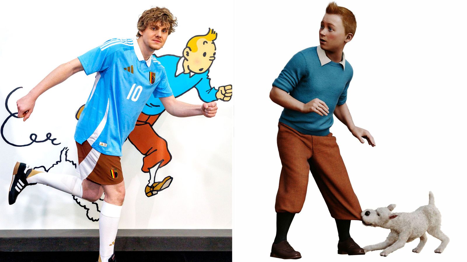
KDB has taken it to the extreme with a haircut to matchBelgium Football Association unveils new Tintin-inspired kit for summer European Championship
The brand new kit, inspired by Belgian cartoonist Herge's intrepid reporter, will be first seen in the 26 March game against England.news.sky.com
Kit designers love this stuff. This is slightly better than the 061 nonsense. Just.

Horrendous? Any maroon top we have is horrendous. The silver one we had, Le Coq, that was abysmal. The 99 top is a Beautiful effort. I have a thing for yellow blue though.I've always said that if you take the occasion and the emotion out of the question, that Wembley '99 kit is horrendous.
Yes; horrendous. I'd have the maroon over it every time.Horrendous? Any maroon top we have is horrendous. The silver one we had, Le Coq, that was abysmal. The 99 top is a Beautiful effort. I have a thing for yellow blue though.
There are support groups out there.Yes; horrendous. I'd have the maroon over it every time.
That's good to know; it sounds like you need their, er, support!There are support groups out there.
