City’s New Kits

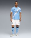
Yea it had grown on me for some time. Could do without the sash, but then there would be some other feature to clutter it up which might be worse, so take this and be happy I guess.

Think it works on this one without going past the shoulder, but on the CWC red/black sash (according to the leak images) I find it odd the way it stops below the shoulder. When on the girona ones for example, puma have taken it past to look more draped over. Hopefully the actual kit looks better, which is usually the case.

1000050650.jpg
 
Puma contact.

"You've got two special kits just for the CWC with sashes on"

Heard it late last summer. Usually on the money.

Obviously you could argue they never actually said no blue home kit but seems strange we'd have 3 CWC options with 2 of them just for that competition.

Even going off those comments (if exactly), they don't specify we wouldn't take a standard blue home kit too.
 
Would be perfect without that stupid stripe
If you squint your eyes, you don't notice it.

Given that based on our performances this season, that may well be how we watch most of out games next season, we may all well forget the sash is on there!
 
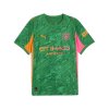
How do they manage to keep our new shirts under wraps? Really looking forward to seeing what it looks like tomorrow
 
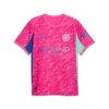
Quite intrigued to see what the concept is behind the kit? The little teaser video they posted seems to relate to some sort of mirror ball/spotlight theme, and the pre-match shirt seems to double down on the diagonal line element. Definitely not as obvious as the mosaic, stadium, 0161 and 93:20 influences on previous home kits...
 
Quite intrigued to see what the concept is behind the kit? The little teaser video they posted seems to relate to some sort of mirror ball/spotlight theme, and the pre-match shirt seems to double down on the diagonal line element. Definitely not as obvious as the mosaic, stadium, 0161 and 93:20 influences on previous home kits...
Heard the sash is at the same angle as Bernardo's left toe
 
Quite intrigued to see what the concept is behind the kit? The little teaser video they posted seems to relate to some sort of mirror ball/spotlight theme, and the pre-match shirt seems to double down on the diagonal line element. Definitely not as obvious as the mosaic, stadium, 0161 and 93:20 influences on previous home kits...
Its the angled trajectory of Vinnies goal against Leicester.

:)
 
Looks like it's sky blue socks too. Much prefer the navy as it's a stronger overall look, but I know most people will be happy. Some random navy on the top of the socks though, for some unknown reason.

At least we've got white shorts!
 

Attachments

  • 1000056582.jpg
    1000056582.jpg
    154.3 KB · Views: 162
Last edited:

Don't have an account? Register now and see fewer ads!

SIGN UP
Back
Top