You are using an out of date browser. It may not display this or other websites correctly.
You should upgrade or use an alternative browser.
You should upgrade or use an alternative browser.
City Kits - 2026/27
- Thread starter HelloCity
- Start date
Bingo.Looks like a lazio kit, wish they would stop fucking about with colours shorts ,socks ect should be blue shirt white shorts & navy socks!
plattlanebenches
Well-Known Member
- Joined
- 10 Jun 2018
- Messages
- 1,645
It’s fucking awful. Thanks
TinFoilHat
Well-Known Member
- Joined
- 26 Jan 2023
- Messages
- 45,267
- Team supported
- Manchester City
To flog 3 different away kits.I reckon Pep saw the kit and that was the final straw
How can you make a City kit predominantly not blue
I won't be surprised if we only have our home strips at the swamp and Klanfield next season.
Dizbuster
Well-Known Member
I agree. Don't worry mate, you and I see things they never will...Think it's beautiful; I love the all-white badge.
Blue2112
Well-Known Member
What really pisses me off with this chart is all the different shades of Blue. We should have an official colour and that should be it for everything but instead we get wishy washy blues to stronger ones like the Kappa Blue we used and anything between. The official Pantone number for Sky Blue is Pantone 14-4318 TCX (for fashion and home textiles) which personally I feel is too dull and grey but we should have an official colour whatever is decided and stick to it on everything and everywhere.

Its really got worse this season. The amount of games we've worn that horrific Sprite kit when we could've worn the home strip - including at Bournemouth.To flog 3 different away kits.
I won't be surprised if we only have our home strips at the swamp and Klanfield next season.
Longballutd
Well-Known Member
- Joined
- 5 Aug 2015
- Messages
- 1,103
Have we a Rag designing these Puma kits?
Really disappointed with the home shirt again this season. Messed around this season with the diagonal white stripe and have the collar and sleeve not white the whole way around. This effort is even worse. The fade from blue to white looks really off but not having the club crest is the real insult.
Don’t get me started on that rain inspired atrocity we’ve been forced to look at over the last few weeks.
OnMeEderson
Member
- Joined
- 21 Apr 2024
- Messages
- 6
- Team supported
- Gods Own..
Don’t worry, we’ve got the fourth kit to come out yet
richards30
Well-Known Member
- Joined
- 20 May 2009
- Messages
- 34,091

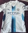
This is rumoured to be the away kit i believe? There are there abouts.
Kippax Street 1880
Well-Known Member
- Joined
- 22 Mar 2010
- Messages
- 8,966
The purple kit I hate with a burning passion
Rorz88
Well-Known Member
Sorry if it has already been mentioned but will we wear it on Sunday ?
Bluesince1979
Well-Known Member
Contract-ably obligated to wear each shirt a set amount of times to allow puma to try and get a fraction of money back on their massively loss leading up front mega monies paid to city.Its really got worse this season. The amount of games we've worn that horrific Sprite kit when we could've worn the home strip - including at Bournemouth.
So when we moan about 3 kits per season , without it we get a lesser deal from the kit manufacturers
skybluethinking
Active Member
- Joined
- 13 Dec 2010
- Messages
- 41
We wore our black & yellow hoops for those games in the treble season!To flog 3 different away kits.
I won't be surprised if we only have our home strips at the swamp and Klanfield next season.
bitterblue78
Well-Known Member
- Joined
- 28 Feb 2009
- Messages
- 1,751
Only at Klanfield. We wore sky blue at the swamp. One out of two is bad enough though.We wore our black & yellow hoops for those games in the treble season!
jamielowndes
Well-Known Member
- Joined
- 15 Jan 2010
- Messages
- 3,453
What really pisses me off with this chart is all the different shades of Blue. We should have an official colour and that should be it for everything but instead we get wishy washy blues to stronger ones like the Kappa Blue we used and anything between. The official Pantone number for Sky Blue is Pantone 14-4318 TCX (for fashion and home textiles) which personally I feel is too dull and grey but we should have an official colour whatever is decided and stick to it on everything and everywhere.
View attachment 192796
Tbf I have a lot of these shirts and they're actually identical in colour. The lighting on these is kind of odd and misleading on this graphic.
blue b4 the moon
Well-Known Member
Normally buy 1 shirt a season from DG, this one won't be being bought.
Think it's really poor, badge not coloured and fade (I know why) only at the front.
Think it's really poor, badge not coloured and fade (I know why) only at the front.
jazzy
Well-Known Member
I didn't think I would like it , but having seen it in the flesh I like it :)
GazM
Well-Known Member
Got the new 3rd shirt today. Really nice