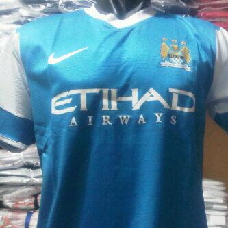
.A. said:super_city_si said:sam-caddick said:I do as well.
It's a bluemoon graphic and theme I think
I thought it was an ultra-sound
It looks like a big fecking bird to me, like that pointless one on the crest. I wish they'd rebrand the badge to a more tasteful retro circular one, or even just the internal shield; the bird and stars are tacky.
Not bloody difficult. Though, to contradict myself, I like (and bought!) the away one. Not that purple "cup kit" monstrosity.McfcMK said:Both are very smart. Much better than this seasons kits anyway.
JoeMercer'sWay said:Dunne's own goal said:Rorz88 said:I like it ! Would prefer the writing to be white but the sponsors would never let it happen (Well Adidas do) Nice kit though
Me too mate. But I'd still buy that.
this would be brilliant too: "White shorts and socks with sky blue details are expected to complete the Manchester City home kit 2015/16."
how is white shorts and socks brilliant? it's wrong.
quiet_riot said:[bigimg]http://i.imgur.com/YPFI4d8.png[/bigimg]