nijinskybell
Well-Known Member
- Joined
- 9 May 2009
- Messages
- 806
leipzigblue said:
It's Superbia in Proelio, by the way.
leipzigblue said:
nijinskybell said:leipzigblue said:
It's Superbia in Proelio, by the way.

Jumanji said:Lose the stars :-)
This is almost perfect just need to change the mcfc in the shield to 1894 and make the shield fit within the circle badge rather than overhanging at the bottom, and finally the scroll should be separate a bit lower than the badge excellent design thoinGavious said:True_Blue69 said:
Can you do one without the eagle and lower the Superbia bit? Reckon that would look good, basically just the old badge but with the new scroll bit on it.

I like this too only I think having Manchester city and mcfc on the badge is too much replace mcfc with 1894inGavious said:
Skashion said:Yeah but no but, make sure it has the Lancashire rose.

Your artistic skills might serve you well but if you were ever asked the following questions in a pub quiz you'd be in real trouble:Stuuuuuu said:Skashion said:Yeah but no but, make sure it has the Lancashire rose.
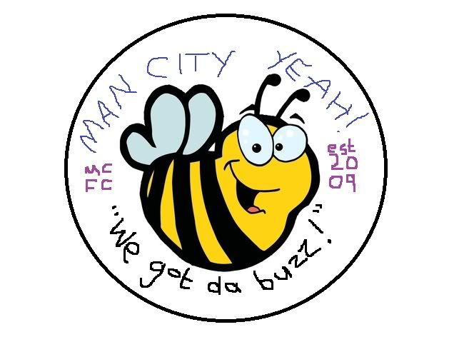
Surely the Manchester Bee, since the city is no longer part of Lancashire? Also, that terrible motto has to go. It must be replaced with something more in touch with the kids if the club is to go forward as tomorrow's leading soccer branding empire. I've put together a quick mock-up. I should stress that this is not the final crest; just a guide to how it will look. This took me about 10 minutes, whereas I will spend up to an hour on the final version.

invisableman said:I like this too only I think having Manchester city and mcfc on the badge is too much replace mcfc with 1894
Skashion said:Your artistic skills might serve you well but if you were ever asked the following questions in a pub quiz you'd be in real trouble:Stuuuuuu said:Skashion said:Yeah but no but, make sure it has the Lancashire rose.
Surely the Manchester Bee, since the city is no longer part of Lancashire? Also, that terrible motto has to go. It must be replaced with something more in touch with the kids if the club is to go forward as tomorrow's leading soccer branding empire. I've put together a quick mock-up. I should stress that this is not the final crest; just a guide to how it will look. This took me about 10 minutes, whereas I will spend up to an hour on the final version.

1) What county do Manchester-born cricketers play for?
2) In what role does the Queen appoint a High Sheriff to the City of Manchester?
My understanding is 1894 is the year we became Manchester city fc, pretty sure the cub telephone number now ends in 1894 and that there is a 1894 bar in the stadiuminGavious said:invisableman said:I like this too only I think having Manchester city and mcfc on the badge is too much replace mcfc with 1894
was 1894 St Marks/Ardwick FC? shouldnt we have the year when we became Manchester City or 1894 the year the club was born?
inGavious said:True_Blue69 said:
Can you do one without the eagle and lower the Superbia bit? Reckon that would look good, basically just the old badge but with the new scroll bit on it.

Swales lives said:Not wishing to be rude InGavious, but these crests are fucking shit.
What you are doing isn't design, it's like a kid's collage. Anyone can take a 2,3,4,5 pieces of something that exists and cobble it together.
Oh put a sky blue background on it and a drop shadow, people love that... Oh no they don't, it's trying to cover weak design. What you are doing is the equivalent of the Royal Mail changing their name to Insignia. It's pointless and a waste of bastard time.
The one with the scrawly bee is better. At least it shows some creativity. Pack it in you charlatan.
Looks too jumbled up.. Too much going on.ban-mcfc said:inGavious said:
can't believe people like this!?
i love both the old and the new, but for me that just doesn't work.
danburge82 said:Looks too jumbled up.. Too much going on.ban-mcfc said:inGavious said:
can't believe people like this!?
i love both the old and the new, but for me that just doesn't work.
We just need to shield from our current crest. A simple shield works for Barca and AC Milan.
I don't like the stars, the eagle or the daft Latin shit. The shield is all I want for our badge. At a push I'd put "1894" where "M.C.F.C" currently is and put "Manchester City F.C." where the daft Latin shit is now.inGavious said:danburge82 said:Looks too jumbled up.. Too much going on.ban-mcfc said:can't believe people like this!?
i love both the old and the new, but for me that just doesn't work.
We just need to shield from our current crest. A simple shield works for Barca and AC Milan.
yeah i agree. i prefer the old badge, cos its clean and simple, maybe it looked dated at the time, why they changed it maybe, but it's easy to update the old one to look a bit more modern without destroying it.
The current one doesn't quite sit right for me. cant put my finger on it why tho.
I made a crappy paint attempt at that a while ago only utilising the eagle crest version, not the circular one.danburge82 said:I don't like the stars, the eagle or the daft Latin shit. The shield is all I want for our badge. At a push I'd put "1894" where "M.C.F.C" currently is and put "Manchester City F.C." where the daft Latin shit is now.inGavious said:danburge82 said:Looks too jumbled up.. Too much going on.
We just need to shield from our current crest. A simple shield works for Barca and AC Milan.
yeah i agree. i prefer the old badge, cos its clean and simple, maybe it looked dated at the time, why they changed it maybe, but it's easy to update the old one to look a bit more modern without destroying it.
The current one doesn't quite sit right for me. cant put my finger on it why tho.
Anyone fancy doing a mock-up?
invisableman said:This is almost perfect just need to change the mcfc in the shield to 1894 and make the shield fit within the circle badge rather than overhanging at the bottom, and finally the scroll should be separate a bit lower than the badge excellent design thoinGavious said:True_Blue69 said:
Can you do one without the eagle and lower the Superbia bit? Reckon that would look good, basically just the old badge but with the new scroll bit on it.

St Ives blue said:invisableman said:This is almost perfect just need to change the mcfc in the shield to 1894 and make the shield fit within the circle badge rather than overhanging at the bottom, and finally the scroll should be separate a bit lower than the badge excellent design thoinGavious said:
ffs! Are you inGavious's client now? Learn Photoshop and do it yourself.
ps. wahay! 100 posts!
danburge82 said:I don't like the stars, the eagle or the daft Latin shit. The shield is all I want for our badge. At a push I'd put "1894" where "M.C.F.C" currently is and put "Manchester City F.C." where the daft Latin shit is now.
Anyone fancy doing a mock-up?

inGavious said:St Ives blue said:invisableman said:This is almost perfect just need to change the mcfc in the shield to 1894 and make the shield fit within the circle badge rather than overhanging at the bottom, and finally the scroll should be separate a bit lower than the badge excellent design tho
ffs! Are you inGavious's client now? Learn Photoshop and do it yourself.
ps. wahay! 100 posts!
dont mind helping if folks dont have photoshop access, no bother if its easy to do.
-- Sun Jan 29, 2012 3:34 pm --
danburge82 said:I don't like the stars, the eagle or the daft Latin shit. The shield is all I want for our badge. At a push I'd put "1894" where "M.C.F.C" currently is and put "Manchester City F.C." where the daft Latin shit is now.
Anyone fancy doing a mock-up?
bit like this .... ish?:

