You are using an out of date browser. It may not display this or other websites correctly.
You should upgrade or use an alternative browser.
You should upgrade or use an alternative browser.
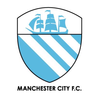
A club crest we can all agree on..
- Thread starter Manchester1894
- Start date
the-ecstacy-of-eight
Well-Known Member
edgecroft said:Worthless? I don't agree with your reasoning at all.the-ecstacy-of-eight said:In_Good_Kompany said:The older one is very outdated, many fans think so and so did the club
As I recall the ONLY reason that we changed the club crest/badge when Franny took over and Swales left was because the bloke/company that designed the round badge had held onto the merchendising rights for the design and as a result a huge percentage of the profits from EVERY item of City merchendise that was sold with that design on it went to the designers and NOT to City, therefore in an attempt to create extra revenue a new design was formulated ..... this fact has since been re-written with the "we were entering a new era" - propoganda. Therefore ANY "new" club crest/badge which incorporates this OLD design is worthless. Sorry to be a killjoy to all your fun and that, but hey-ho .... Photoshop's great innit.
Just because the new design was brought in to stop the round badge designer from getting a cut of everything, that doesn't mean that the new design isn't now part of our heritage and traditions and there is no reason why elements of it can't be incorporated into a new design.
Add to that the fact that the new design has distinct similarities to the Emblem of the UAE, where of course our owner resides.
Here is the new coat of arms in use since 2008:

What's even more interesting is that the old emblem used up to 2008 is even more similar to our badge:

I wouldn't think that our owner would ditch ALL the elements of our badge that resemble those of his homeland because of he's a purist about our original badge when the new one would strike a chord with him.
Ingavious' design with the round bit in front of the eagle is even closer to the UAE's, so I think he's on the right path.

Sorry for the confusion I caused due to an early morning OLD/NEW typo .... Typo has since been changed
inGavious
Well-Known Member

something a bit different, a bluemoon rising over the Etihad instead of the ship and "superbia in urbis" = "Pride in the City" ...... and a new bluemoon logo cos i was bored.
Le Havre Oswald
Well-Known Member
inGavious said:
something a bit different, a bluemoon rising over the Etihad instead of the ship and "superbia in urbis" = "Pride in the City" ...... and a new bluemoon logo cos i was bored.
reminds me of star trek
The Pink Panther
Well-Known Member
- Joined
- 22 May 2005
- Messages
- 16,214
mcfc2607 said:inGavious said:
something a bit different, a bluemoon rising over the Etihad instead of the ship and "superbia in urbis" = "Pride in the City" ...... and a new bluemoon logo cos i was bored.
reminds me of star trek
It looks like a Christmas pudding
inGavious said:
something a bit different, a bluemoon rising over the Etihad instead of the ship and "superbia in urbis" = "Pride in the City" ...... and a new bluemoon logo cos i was bored.
Hahahaha, you missed off the clangers ;)
ManCitySFC
Active Member
Anybody off here that can create a supporters club logo for me? Desperate for one as soon as possible for a tournament at Etihad.
Manchester City Supporters Football Club or MCSFC in title.
Some great designs on here.
Please get in touch if you can help a fellow blue out.
Tommy Dawson
mcsfc@outlook.com
@ManCitySFC
Manchester City Supporters Football Club or MCSFC in title.
Some great designs on here.
Please get in touch if you can help a fellow blue out.
Tommy Dawson
mcsfc@outlook.com
@ManCitySFC
ManCitySFC said:Anybody off here that can create a supporters club logo for me? Desperate for one as soon as possible for a tournament at Etihad.
Manchester City Supporters Football Club or MCSFC in title.
Some great designs on here.
Please get in touch if you can help a fellow blue out.
Tommy Dawson
mcsfc@outlook.com
@ManCitySFC
Tommy ... I've done a few concept ones on here ... so if it its a question of time, might save time, otherwise just say what you need instead. I'll mail you now.
the god Gerry Gow
Well-Known Member
- Joined
- 15 May 2008
- Messages
- 2,738
I'm not backing any crest which doesn't feature mancinis face. I am gonna stomp my foot threaten to not renew and slag off every one who disagrees with me.
Have I got the hang of this yet.
Have I got the hang of this yet.
the god Gerry Gow said:I'm not backing any crest which doesn't feature mancinis face. I am gonna stomp my foot threaten to not renew and slag off every one who disagrees with me.
Have I got the hang of this yet.
^^^ "Top Blue" ;)
the god Gerry Gow
Well-Known Member
- Joined
- 15 May 2008
- Messages
- 2,738
ZabbaStuntDouble said:the god Gerry Gow said:I'm not backing any crest which doesn't feature mancinis face. I am gonna stomp my foot threaten to not renew and slag off every one who disagrees with me.
Have I got the hang of this yet.
^^^ "Top Blue" ;)
Thanks for that. Am quite emotional now. Never thought I'd achieve that
inGavious said:
That's brilliant.
adrianr said:inGavious said:
That's brilliant.
Cheers .... let's be honest .... i didnt really do much, just put 2 together.
Dave Ewing's Back 'eader
Well-Known Member
Manchester1894 said:
That bird looks a little too like Moygerson for my liking!
ZabbaStuntDouble said:adrianr said:inGavious said:
That's brilliant.
Cheers .... let's be honest .... i didnt really do much, just put 2 together.
From your kit mockups, I take it you work as a retoucher/graphic designer?
A
A
Anonymous
Guest
can anyone put this inside the circle with the manchester city fc pls?


adrianr said:ZabbaStuntDouble said:adrianr said:That's brilliant.
Cheers .... let's be honest .... i didnt really do much, just put 2 together.
From your kit mockups, I take it you work as a retoucher/graphic designer?
nope ... i just do it to stop my brain turning to mush after suffering a stroke a few years back. It helps to stimulate the creative areas of the brain to keep it active, so i have the brain power to talk and write etc. Purely started as a therapy tool and just kept with it. I'm just self-taught so i'm only as good as what i can do.
-- Mon May 13, 2013 2:23 pm --
ban-mcfc said:can anyone put this inside the circle with the manchester city fc pls?

do i have to? you cant draw a circle?
ZabbaStuntDouble said:adrianr said:ZabbaStuntDouble said:Cheers .... let's be honest .... i didnt really do much, just put 2 together.
From your kit mockups, I take it you work as a retoucher/graphic designer?
nope ... i just do it to stop my brain turning to mush after suffering a stroke a few years back. It helps to stimulate the creative areas of the brain to keep it active, so i have the brain power to talk and write etc. Purely started as a therapy tool and just kept with it. I'm just self-taught so i'm only as good as what i can do.
Sorry to hear that mate, sounds rough. Well if you're able, you should consider it. I work with people who make living doing stuff not as good as that!
the god Gerry Gow
Well-Known Member
- Joined
- 15 May 2008
- Messages
- 2,738
adrianr said:ZabbaStuntDouble said:adrianr said:From your kit mockups, I take it you work as a retoucher/graphic designer?
nope ... i just do it to stop my brain turning to mush after suffering a stroke a few years back. It helps to stimulate the creative areas of the brain to keep it active, so i have the brain power to talk and write etc. Purely started as a therapy tool and just kept with it. I'm just self-taught so i'm only as good as what i can do.
Sorry to hear that mate, sounds rough. Well if you're able, you should consider it. I work with people who make living doing stuff not as good as that!
Good on you ZSD.
Doing some great stuff n hope things are improving for you

