Bring back the old badge, official campaign.

ban-mcfc said:
*tin hat on*


I know it's been done before but come it's just so much better than the new one...
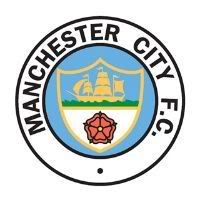
RetroCrest.jpg


do the decent thing nike and give city their proper badge back.

agree or disagree?


stop living in the past fella.. move on..<br /><br />-- Sun Apr 28, 2013 4:54 pm --<br /><br />
Bert Trautmann's Parachute said:
Or at least get rid of that golden fucking eagle from the badge. Never seen anything bigger than a goshawk in Manchester. Oh, and the odd overweight wood-pigeon....

and when was the last time you saw a golden gallion ??
 
gordondaviesmoustache said:
The 'new' badge is actually sixteen years old and I do reckon we need a new design, which more accurately reflects what our club is about.

Firstly I would go from three stars to four, just to annoy the fuck out of united fans.

Secondly I would replace the eagle with a symbol that our supporters would more readily identify with: a silhouette of Stockport Viaduct would be perfect.

The motto should be changed to "ingens et amarum"

I would replace the boat with an oil tanker.

Job's a good 'un.

Well, I appreciated it GDM ;-)
 
gordondaviesmoustache said:
The 'new' badge is actually sixteen years old and I do reckon we need a new design, which more accurately reflects what our club is about.

Firstly I would go from three stars to four, just to annoy the fuck out of united fans.

Secondly I would replace the eagle with a symbol that our supporters would more readily identify with: a silhouette of Stockport Viaduct would be perfect.

The motto should be changed to "ingens et amarum"

I would replace the boat with an oil tanker.

Job's a good 'un.

I laugh at the "new badge" use ... anyone would think its not our "current badge". Think those that say "new badge" are obviously advocates of the "old badge" or the "older badge than the old badge" or even the "first badge that preceeded all the other badges" lol

What does a bridge over Stockport be more identidied than something from the city of Manchester?
 
Old one for me. New one is awful though it looks better in black. The mock up looks decent but I would lose the "Est" bit and just have 1894 on it...
 

Don't have an account? Register now and see fewer ads!

SIGN UP
Back
Top
  AdBlock Detected
Bluemoon relies on advertising to pay our hosting fees. Please support the site by disabling your ad blocking software to help keep the forum sustainable. Thanks.