blue b4 the moon
Well-Known Member
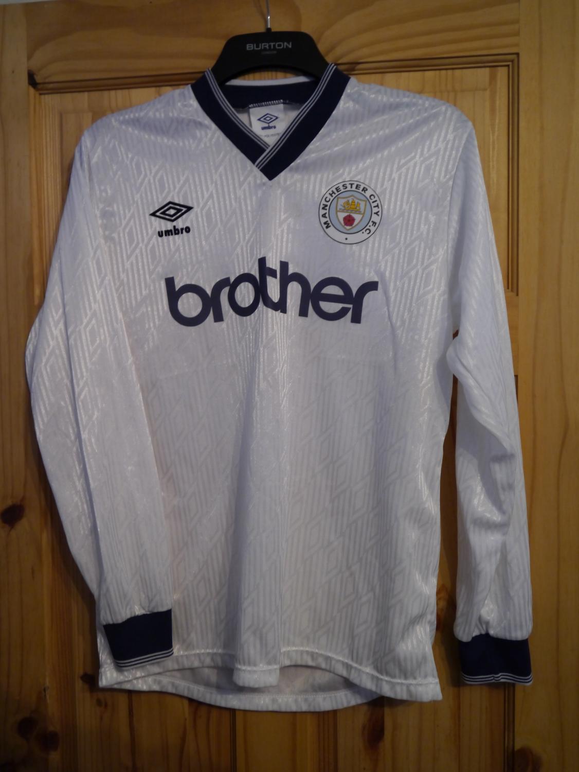
Surely that's a fake...all the TV's in raggy households will give up the ghost with that.That’s an abomination.

Surely that's a fake...all the TV's in raggy households will give up the ghost with that.That’s an abomination.

That’s an abomination.

That’s an abomination.

Only 2 sizes on official site and not got mine.
Plus if you sign up for Pumas newsletter they give you a 15% off code.
I paid £38.25 in the end plus free delivery

Third white as the Ulsterman says above.Home sky blue. Away red and black stripes or maroon.
When Umbro were doing our kits in the Sparky/Bescarfed one era, they reckoned that red and black was not a great seller, which probably comes as a surprise to some.Home sky blue. Away red and black stripes or maroon.
Why is it that almost anyone on the internet can design kits way better in concepts than the actual so called designers and the kit manufacturers ... their job would be much simple to just browse twitter every spring and pick up some ready made designs for next summer ...
That’s an abomination.

Thanks for this - it looks so much nicer without the sponsor logo to me - just ordered one with the discount. For reference on the Puma site (https://eu.puma.com/uk/en/home) go to the bottom right of the page where it says "Email Sign Up".Only 2 sizes on official site and not got mine.
Plus if you sign up for Pumas newsletter they give you a 15% off code.
I paid £38.25 in the end plus free delivery
That’s an abomination.

