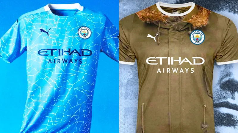
City’s New Kits - 2020/21 - [Old Thread]

Played with the templates.

download33.png

download34.png

download35.png
That paisley works really well with the away colour scheme. However I see why they used the one they have used.
 
Had a go at making the new kit's concept a bit subtler. Making a mosaic of the crest mosaic and then giving it all a blue filter so it doesn't stand out too much. I think it looks a little nicer.

YXumqna.jpg
see, how hard is that Puma ? FFS. Really nice shirt that mate.
 
Last edited:

Like our Centurions special kit, that away kit ruined by the sponsor cutting through the sash.

But fairly nice kits. The home is decent.

Still think our new away and third are brilliant and better than WH’s away and third.
 

Don't have an account? Register now and see fewer ads!

SIGN UP
Back
Top
  AdBlock Detected
Bluemoon relies on advertising to pay our hosting fees. Please support the site by disabling your ad blocking software to help keep the forum sustainable. Thanks.