City’s New Kits

Yep, hated it. The Kappa design wasn’t the issue, it was the shade of blue. Our colour is pale/light blue (Sky Blue)
I remember the bullpooh they said about the blue getting lighter and lighter, like the way we played. It did feel like a system reboot when sky blue returned in 2003. It was sorely missed.
 
Yep, hated it. The Kappa design wasn’t the issue, it was the shade of blue. Our colour is pale/light blue (Sky Blue)

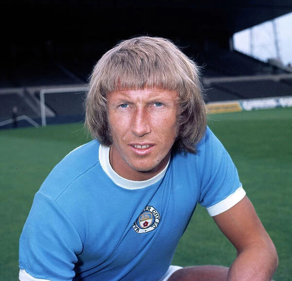
For most of our history the colour was never actually pale blue but it became a washed out pale blue in the 80’s and early-mid 90’s.

Before

colin-bell-manchester-city-7654595.jpg.webp


After

E5mV7sQXMAYGOCf
 
For most of our history the colour was never actually pale blue but it became a washed out pale blue in the 80’s and early-mid 90’s.

Before

colin-bell-manchester-city-7654595.jpg.webp


After

E5mV7sQXMAYGOCf
Yeah we’ve pissed about with the shade over the years, however If you check back historically our colours were either listed as Pale Blue or Light Blue. Only in the 1950’s did it start to be referred to as Sky blue. If you can get hold of any old programmes you may see this. Personally I prefer the 1968-1970 shade

from Historical kits…

After the Second World War, City's colours were described as "light blue" and, towards the end of the decade, "sky blue." There is no evidence to suggest that the shade of their shirts changed, however, merely that these terms were thought to be more modern.
 
Last edited:

Don't have an account? Register now and see fewer ads!

SIGN UP
Back
Top
  AdBlock Detected
Bluemoon relies on advertising to pay our hosting fees. Please support the site by disabling your ad blocking software to help keep the forum sustainable. Thanks.