citymad
Well-Known Member
It's alright everyone I believe they're Everton. Ha!
It's alright everyone I believe they're Everton. Ha!
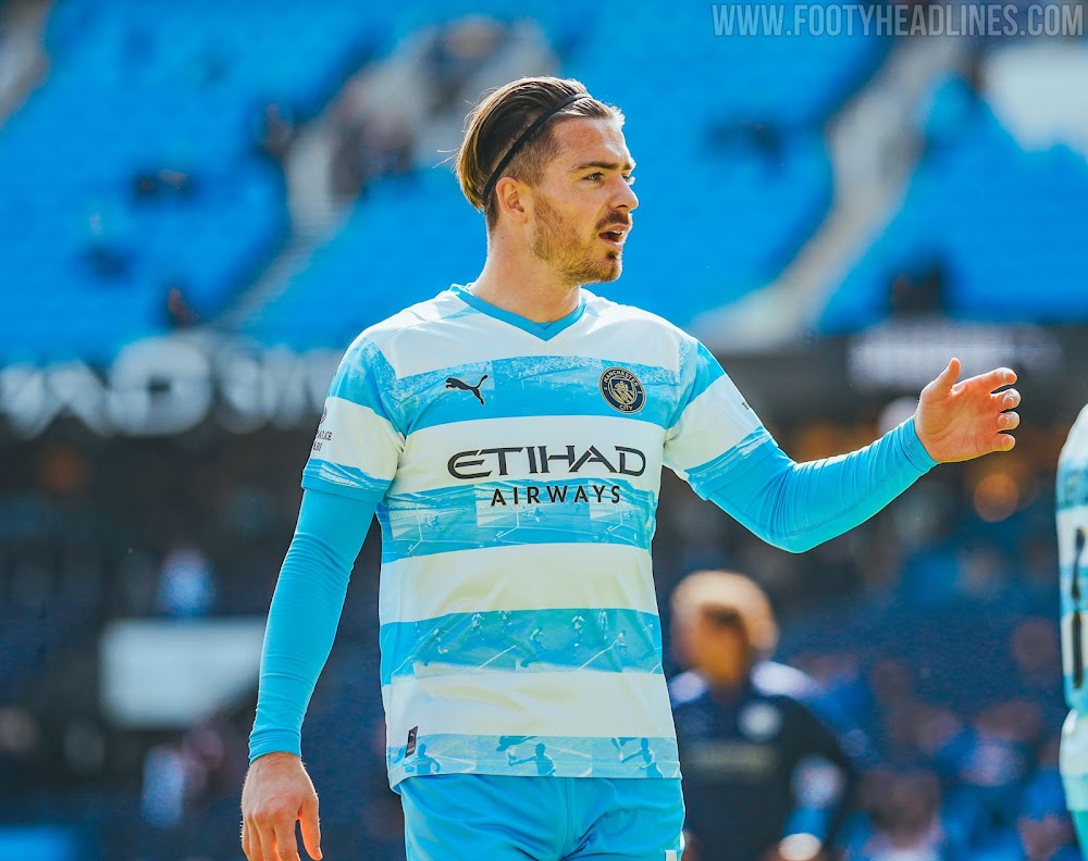
i feel the same to a degree, the puma logo needs to be on one side , it looks too busy as is , i am a sky blue and white girl but it is ok i guessNot impressed. Prefer the Puma logo and the club crest on either side, rather than down the middle.
Can’t understand why so many people like it, think it’s fucking shite personally. Worst one in a whileNot impressed. Prefer the Puma logo and the club crest on either side, rather than down the middle.
lubed or dry?I’ll give him 4 fingers behind the bike shed
Excellent question. If it’s on a Thursday, definitely drylubed or dry?
This season’s home kitDo we know what the players will wear on Sunday yet?
Imagine this in those colours and wirhout the aguerooooo pattern and that what it is apparently

This season’s home kit
Fucking hell, what will the stewards wear?
"if"?I imagine if we do win the league they will get changed into the new kit for the trophy lift
It's horribleFucking hell, what will the stewards wear?
So now there‘s something in my bloody eyes.I wouldn't blame any blue for going FKW with that kit
I think that might have spoiled your chance at the shirt lolExcellent question. If it’s on a Thursday, definitely dry
Useful for cyclists.It's horrible
