City's New Kits - 2019/20

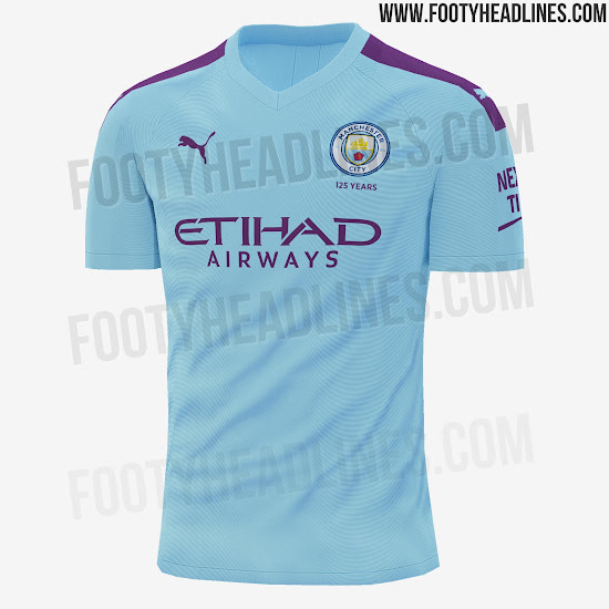
I’d say this was better than every single Nike home shirt except the 17/18 one.

It’s also better than the 11/12 & 12/13 Umbro home shirts imo.
manchester-city-19-20-home-kit-2.jpg

Yep we’ve had far worse in recent years that’s for sure.
White shorts and blue socks which is great.
I won’t even notice the purple after a few games.
 
You have noticed the purple on it as subtle as it isn’t?

What about it? Nothing wrong with mixing it up with a different trim colour now and then as long as it’s not overbearing to the overall kit.

You won’t even notice it from the stands either where all you’ll see is a blue shirt with white shorts.

I’d say the moment to be overly concerned is when they start making the sleeves a different colour or mixing up the shorts as has been done in recent years, not when there’s a purple band on the shoulder or when the sponsor logo text is that same colour as well.

Collar looks decent, good shade of blue, no crazy pattern in the shirt, nothing too drastic on the sleeves, white shorts. Sounds good to me.
 
Is that bad? Think the sponsor looks better than it has for years, the shoulders are ok, Good shirt will look even better with the shorts and socks which how it should be judged.

Are you a FKW ? By any chance... lol,
 
What about it? Nothing wrong with mixing it up with a different trim colour now and then as long as it’s not overbearing to the overall kit.

You won’t even notice it from the stands either where all you’ll see is a blue shirt with white shorts.

I’d say the moment to be overly concerned is when they start making the sleeves a different colour or mixing up the shorts as has been done in recent years, not when there’s a purple band on the shoulder or when the sponsor logo text is that same colour as well.

It’s a strange argument saying you like it because you won’t notice the purple from a distance.
 
It’s a strange argument saying you like it because you won’t notice the purple from a distance.
To be fair, I’ve always thought the Mona Lisa was a much better painting from about 100 yards away.
 
It’s a strange argument saying you like it because you won’t notice the purple from a distance.

If you’re a 16 year old fashion student I’d understand your argument. I kinda hope you are really.

Tbh, I like the look of it because it looks better than the vast majority of shirts we’ve had over the last decade.

All this over a bit of purple on the shoulders.

Crazy.
 
If you’re a 16 year old fashion student I’d understand your argument. I kinda hope you are really.

Tbh, I like the look of it because it looks better than the vast majority of shirts we’ve had over the last decade.

I think we can call it a difference of opinion to halt proceedings and yes I’m a 16 yr old fashion student. Only such a person would think purple on a city home kit is not only shite but a pointless exercise. I’m hoping for green,yellow,brown,red,pink in the future.
 
I think we can call it a difference of opinion to halt proceedings and yes I’m a 16 yr old fashion student. Only such a person would think purple on a city home kit is not only shite but a pointless exercise. I’m hoping for green,yellow,brown,red,pink in the future.

Imagine being this upset over a bit of purple on the shoulder.

Small time.

To be fair, it sounds like they wanted to do something a little different this season anyway with the anniversary shirt also available.
 

Don't have an account? Register now and see fewer ads!

SIGN UP
Back
Top
  AdBlock Detected
Bluemoon relies on advertising to pay our hosting fees. Please support the site by disabling your ad blocking software to help keep the forum sustainable. Thanks.