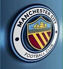
Club Badge (merged)

I'm not gonna be writing in to City or anything - I'm not a responsible or very productive member of MCFC family/community... but in the spirit of sticking my nose in just for the sake of it...

I just want to keep the boat, above all, as it is the most 'Manchester' thing on our badge. It represents... well, I'm sure everyone knows now as articles are coming left and right about it... But yeah, keep the ship and err, if it's not too much trouble, keep the rose too, (although I'm not too bothered about the rose.)

T'is a great thing City are doing; getting the community in on the action. I suspect they are simply placating us so that they might have a circular badge, but still, I want a circular badge like the one I grew up with anyway, so win-win and we show yet again that Manchester City are tightly connected with the community. (More so than many of our peers.)
 
2 things for me are, firstly fuck what fc scum have as a badge the cunts don't like it if ours is round with a shield then tough tits also it's hardly like people globally are gonna mix us up as thats what our badge will be part of a global operation
secondly once we pick a badge let's stop this monocrome bollocks and just use the proper badge on everything. also has to be something like this

image-1.png


even this round badge looks more professional than that ms paint wank the toy rags have, we just need a badge with rhis in mind but maybe more up to date
 
Last edited:
Apologies for the rudimental design skills, but just wanted to show how the core design that is so popular on here is perfectly adaptable for the modern age.

Most badges nowadays are converted to monochrome for away kits and other marketing material. If we had a red rose on the badge, in monochrome it would appear as a white rose. I'm not sure what the die hard Lancastrians would feel about that.

Using the ship and 3 shield design though, the design still looks clean, simple and iconic.

I started off thinking I'd prefer the main badge to have the maroon / red shield and gold stripes, like number 1.

But the more I think about it, the more I think the sky blue shield with white stripes will be better like number 2. This colour scheme looks more instantly recognisable as Manchester City when it appears on posters, newspapers, TV, social media etc, without needing to be on a sky blue shirt.

The sky blue shield is also an element of our current badge, so it's keeping that continuity and making it easily recognisable for our many fans around the world who are unfamiliar with the Manchester Coat of Arms. It instantly says Manchester City, whereas the red / maroon shield with gold is not instantly recognisable as City to the under 40s.

I'm sure Gav's getting wary of the requests, but if there is anyone else with decent design skills who could illustrate the core design with different colour schemes I'd be most grateful. :-)

1.
0FtTYXy.png


2.
yz8M6OU.png


3.
VKUQPNK.png


4.
BfE08xK.png
After what you said about the badge being used on websites away from the kit and on official documents or used in the media that may not have sky blue around it, i think having #2 as the badge would be ideal as it shows the core colours more than #1. But any of those would look good on the kits.
 
Apologies for the rudimental design skills, but just wanted to show how the core design that is so popular on here is perfectly adaptable for the modern age.

Most badges nowadays are converted to monochrome for away kits and other marketing material. If we had a red rose on the badge, in monochrome it would appear as a white rose. I'm not sure what the die hard Lancastrians would feel about that.

Using the ship and 3 shield design though, the design still looks clean, simple and iconic.

I started off thinking I'd prefer the main badge to have the maroon / red shield and gold stripes, like number 1.

But the more I think about it, the more I think the sky blue shield with white stripes will be better like number 2. This colour scheme looks more instantly recognisable as Manchester City when it appears on posters, newspapers, TV, social media etc, without needing to be on a sky blue shirt.

The sky blue shield is also an element of our current badge, so it's keeping that continuity and making it easily recognisable for our many fans around the world who are unfamiliar with the Manchester Coat of Arms. It instantly says Manchester City, whereas the red / maroon shield with gold is not instantly recognisable as City to the under 40s.

I'm sure Gav's getting wary of the requests, but if there is anyone else with decent design skills who could illustrate the core design with different colour schemes I'd be most grateful. :-)

1.
0FtTYXy.png


2.
yz8M6OU.png


3.
VKUQPNK.png


4.
BfE08xK.png
How would No1 look if we shrunk the shield to fit in the eagle(as in the present badge), but still kept the round outer. Best of both worlds I think, but could be a bit to much going on. If anyone could do that ,would appreciate it .
 
How would No1 look if we shrunk the shield to fit in the eagle(as in the present badge), but still kept the round outer. Best of both worlds I think, but could be a bit to much going on. If anyone could do that ,would appreciate it .

Somebody did just that about 20 pages or so back mate. You're right though, it looked too busy and just didn't work.
 
http://www.bbc.co.uk/programmes/p035t406#play

blue tuesday great listen, learnt a lot about the badge. from every thing I've heard and seen i think we should base the design on the 1930s badge onwards. the ship, the 3 rivers, full manchester city name, round badge. The only other things id consider would be the date 1894 or possibly the manchester bee
 
Last edited:
http://www.bbc.co.uk/programmes/p035t406#play

blue tuesday great listen, learnt a lot about the badge. from every thing I've heard and seen i think we should base the design on the 1930s badge onwards. the ship, the 3 rivers, full manchester city name, round badge. The only other things id consider would be the date 1894 or possibly the manchester bee
I believe that your first sentence is developing into the consensus. The #2 blue version is certainly growing on me. Not sure we need nor can accommodate the '1894' but it would be of historical value if the bees were found a place.
 

Don't have an account? Register now and see fewer ads!

SIGN UP
Back
Top
  AdBlock Detected
Bluemoon relies on advertising to pay our hosting fees. Please support the site by disabling your ad blocking software to help keep the forum sustainable. Thanks.