Club Badge (merged)

Plus you need a badge that looks coherent in small sizes across various social media that could be square or circular.

Yeh I agree. I like these QPR designs, clean, simple, iconic. That's what we need for the modern era. I really hope we don't try and over complicate it, try to be too clever. The best designs work just as well in monochrome as they do in full colour.

That's why for me this core design on the left is so obviously the root we should go down. Works on so many levels.

CWO951lWEAEeZYS.jpg
Personally I think the inner shield is too much for the direction badges seem to have gone. I don't think the new badge would support a shield, a ship and the diagonals. I know people are used to the old badge but if you put that out of mind I think the space between the shield and the circle is a bit strange. From a theoretical design point of view I don't get "why" it'd be there.

Part of me expects a circle with solid diagonals and a simple negative space icon in centre. Which would bring us rather in line with Bayern, Juve and Chelsea.
 
This may have been answered already but have they revealed when the new badge will be used?
 

Personally I think the inner shield is too much for the direction badges seem to have gone. I don't think the new badge would support a shield, a ship and the diagonals. I know people are used to the old badge but if you put that out of mind I think the space between the shield and the circle is a bit strange. From a theoretical design point of view I don't get "why" it'd be there.

Part of me expects a circle with solid diagonals and a simple negative space icon in centre. Which would bring us rather in line with Bayern, Juve and Chelsea.

Thing is ... we are City, not Bayern, Juve or Chelsea and shouldn't try and copy their's but retain some sort of identity that is City throughout. The shield is something that has featured in all of our badges and we can argue that that is synonymous to City, like the Lion is to Chelsea, Stripes are to Juve and the Bavaria Flag of Bayern.

if you take the Shield away (which has 'floated' with more space around the sides in the past), to fill the whole circle as which I assume you're suggesting, it just looks like a fat circle shield instead with more empty space ...

CWUEsYUXIAIfyAg.jpg
 
Last edited:


Thing is ... we are City, not Bayern, Juve or Chelsea and shouldn't try and copy their's but retain some sort of identity that is City throughout. The shield is something that has featured in all of our badges and we can argue that that is synonymous to City, like the Lion is to Chelsea, Stripes are to Juve and the Bavaria Flag of Bayern.

if you take the Shield away (which has 'floated' with more space around the sides in the past), to fill the whole circle as which I assume you're suggesting, it just looks like a fat circle shield instead with more empty space ...
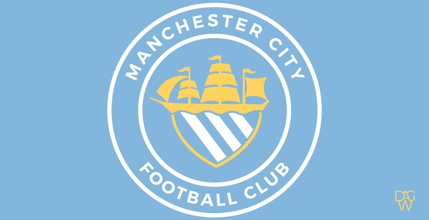
CWUEsYUXIAIfyAg.jpg

Totally agree with this. The shield represents City and the city of Manchester.
 

Don't have an account? Register now and see fewer ads!

SIGN UP
Back
Top
  AdBlock Detected
Bluemoon relies on advertising to pay our hosting fees. Please support the site by disabling your ad blocking software to help keep the forum sustainable. Thanks.