Keepingthefaithsince1976
Well-Known Member
I'm not worried or upset about the loss of "FC", however, personally I would have "Manchester City" all along the top. I get though why some would like "FC" or football club included both from a visual persepctive and/or a professional type stand point, for lack of a better term. It's not a worry of people forgetting we're a football club, that's silly, but it does give a more business type impression. Which of course we ultimately are but it does add instant recognition to the sport when included.
Some want the rose, ship etc for historical purposes and others wanted them for visual purposes. Same for the "football club". I must admit it does look better to me with "football club at the bottom but I don't need it there for identity purposes. I understand the idea of 'branding', like how the Premier League won't be the Barclay's Premier League for much longer; they want an NFL/MLB type branding.
I could take or leave the FC on this badge, centre the name then of course, add 2 more "lines" under the ship and it's sorted imo. Though I'd like a less comic sans type ship.
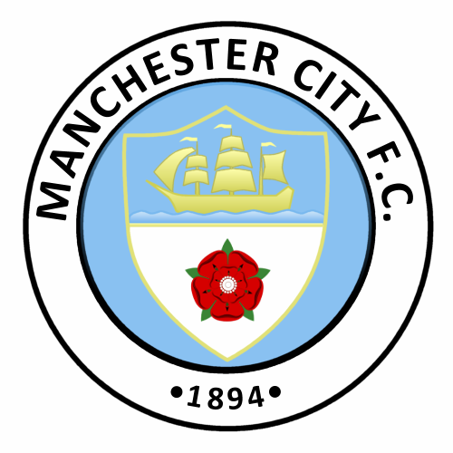
That's a great badge.