You are using an out of date browser. It may not display this or other websites correctly.
You should upgrade or use an alternative browser.
You should upgrade or use an alternative browser.
Club Badge (merged)
- Thread starter MCRJON
- Start date
Gareth Barry Conlon
Well-Known Member
- Joined
- 5 Sep 2014
- Messages
- 15,895

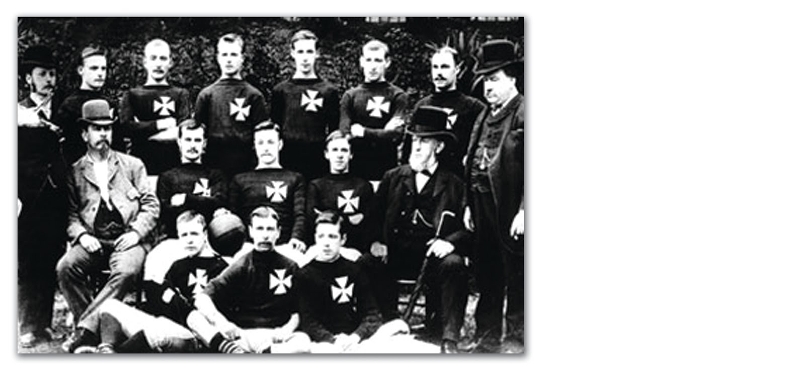
Needs to be very simple imho. Reference to original three rivers and origins with WG St Marks. Who we are, where we are, where we came from and what we do.
Like.
Eccles Blue
Well-Known Member

Needs to be very simple imho. Reference to original three rivers and origins with WG St Marks. Who we are, where we are, where we came from and what we do.
Sorry, those are definitely not to my taste. The Maltese cross means nothing to me whatsoever. Just my humble opinion.
G-Star Medium Rare
Well-Known Member

Needs to be very simple imho. Reference to original three rivers and origins with WG St Marks. Who we are, where we are, where we came from and what we do.
Whats the significance of the Maltese Cross?
Can't see that going down too well with our owners!
( Knights Templars crusades against Muslims in the " holy lands" etc etc)
Fat Chance
Well-Known Member
- Joined
- 2 Jul 2009
- Messages
- 3,060
I like those badges highlighted by Ninjinsky, they'd work on different colour kits (though we only need to illustrate the calatrava type cross once)...don't like the typeface though...love to see what they would look like with the more squashed type of typeface
Whats the significance of the Maltese Cross?
Can't see that going down too well with our owners!
( Knights Templars crusades against Muslims in the " holy lands" etc etc)
ever heard of St. Mark's???
IanBishopsHaircut
Well-Known Member
Whats the significance of the Maltese Cross?
Can't see that going down too well with our owners!
( Knights Templars crusades against Muslims in the " holy lands" etc etc)

https://en.wikipedia.org/wiki/History_of_Manchester_City_F.C._(1880–1928)
Metal Biker
Well-Known Member
- Joined
- 3 Jul 2009
- Messages
- 22,463
- Team supported
- Manchester City (and McLaren F1)
Yes, I can imagine they're still seething about it.Whats the significance of the Maltese Cross?
Can't see that going down too well with our owners!
( Knights Templars crusades against Muslims in the " holy lands" etc etc)
desperatedon
Well-Known Member
another attempt to gather any support at all to save our birdie! :-)

Now that has real potential.

Needs to be very simple imho. Reference to original three rivers and origins with WG St Marks. Who we are, where we are, where we came from and what we do.
Adidas would be proud.
Adidas would be proud.
Many of the designs that include the three rivers do look a bit Adidas like...not sure if Nike will like this!
hadfield blue
Active Member
- Joined
- 30 Jun 2009
- Messages
- 39
The MEN reporting that we can go back to the second round badge,as the person who owned the club shop says he does not own the badge,so City are free to revert back to it, that gets my vote
http://www.manchestereveningnews.co...ews/manchester-city-free-change-back-10299158
http://www.manchestereveningnews.co...ews/manchester-city-free-change-back-10299158
Last edited:
Many of the designs that include the three rivers do look a bit Adidas like...not sure if Nike will like this!
wasnt just that, the two tome colour scheme screams Adidas/Originals to me .... meant meant to obviously, but does to me.
I know what you mean...the same colours as an Adidas trainers box!!wasnt just that, the two tome colour scheme screams Adidas/Originals to me .... meant meant to obviously, but does to me.
Citizen of Legoland
Well-Known Member
- Joined
- 15 Jan 2013
- Messages
- 11,947
Reminds me of Blue Peter badges.Adidas would be proud.
I've just completed the online questionnaire and can understand the relevance of most themes proposed. The ship, rose and rivers from previous emblems, I also like that other symbols are being considered such as the bees and the maltese cross. It's clear that those behind the scenes have hit many right notes and done their homework with the fans.
One element that surprised me was the inclusion of cotton bales as suitable for debate. This for me is a complete non-starter.
Yes, I'm aware of the Cottonopolis tag that Manchester had in Victorian times but as we are now a global club seeking to expand our fan base including cotton bales in some format would be a PR disaster.
In the US, a key market for us, the message, though over simplified, is a basic one. Cotton = cotton picking = plantation = slavery. No professional sports team in America would go anywhere near this. Given how the federal government has recently removed the licensing trademark from the Washington Redskins, these issues are very much under scrutiny.
Yes, we do have a statue of Abraham Lincoln near the Town Hall and during the Civil War, Manchester supported his blockade of trade routes from the southern states to the detriment of many living here but for the 50 years leading up to that, Manchester grew to be an economic force based on the raw materials provided by an enslaved workforce.
Silva_Spell
Well-Known Member
- Joined
- 4 Oct 2014
- Messages
- 5,319
I like these 2
So I tweaked & mashed em together

Part of me won't like getting rid of the Eagle. It makes the badge look less 'soft'
another attempt to gather any support at all to save our birdie! :-)

So I tweaked & mashed em together

Part of me won't like getting rid of the Eagle. It makes the badge look less 'soft'
Citizen of Legoland
Well-Known Member
- Joined
- 15 Jan 2013
- Messages
- 11,947
Room for three stars above the Eagle's head, there.I like these 2
So I tweaked & mashed em together

Part of me won't like getting rid of the Eagle. It makes the badge look less 'soft'
IanBishopsHaircut
Well-Known Member
Manchester grew to be an economic force based on the raw materials provided by an enslaved workforce.
To be fair you could say that about most of Western Society
Sc0tt
Well-Known Member

Part of me won't like getting rid of the Eagle. It makes the badge look less 'soft'
Winner winner eagle dinner, looks great.

