Oyster28catcher
Well-Known Member
- Joined
- 3 Jul 2010
- Messages
- 7,610
- Location
- https://acton28.blog/
- Team supported
- CITY/Aberystwyth Town
very Brazilian design. I wonder if Lommel SK will use it for their green home shirt too. Classic in the making.
Puma pay us big bucks, i would imagine they would want us to wear it in the champs league final.Please only wear it next season I want to (hopefully) see us lift 3 trophies in our current kit!
Calling @Mad Eyed Screamer to the discussion!Looks nowt like Coventry
not at the beginning of this season.Every season is the same: we start saying that we hate the new kit and that we rather keeping the old one.
Pity there isn't an 's' on the end of the postcode.So, will any lost shirts get posted back?
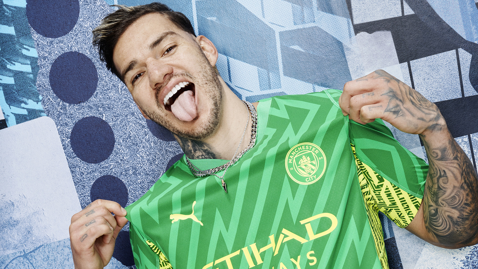
I love the new GK kitView attachment 79743
 (3).gif")
Have you never heard that Manchester prat who is a poet and big Rag fan. Scruffy looking twat with straggly hair. John some fucker.Lol. Never heard that accent across Manchester, ever.
Maybe we all begin to sound like that when a camera is on us... Manchestoh!
It's that dazzling, you need sunglasses to look at it!I'm confused ahaha
what does this mean?
Bishop?Have you never heard that Manchester prat who is a poet and big Rag fan. Scruffy looking twat with straggly hair. John some fucker.
I think this season it is more a mix of “like it” or “meh” that will turn in to “iconic” if we win the quintuple.Every season is the same: we start saying that we hate the new kit and that we rather keeping the old one.
Every season is like that. Some people seems to be paid for finding flaws and others would love the kit even if it were red.I think this season it is more a mix of “like it” or “meh”
I think this season it is more a mix of “like it” or “meh” that will turn in to “iconic” if we win the quintuple.
I am firmly in the “meh” camp. Not bad, but looks bland, especially compared to this season’s (hopefully treble winners) masterpiece.
Agree to disagree there.I dare say the new home shirt is better than every single home shirt since 10-11 apart from the current one.
Agree to disagree there.
Since 10/11?Which ones would you have above it? Of the ones in between I did like the 17-18 shirt. I’m a sucker for the plainer shirts tbf.