M
M
mat
Guest
Rather than map of the city on the third kit Nike should just put Frank Gallagher on it.
Fair enough, the goalie kit isn't one I've been able to get through "unofficial" sites in kids' sizes. Hence my lad wearing a small adult - it fucking dwarfs him!!
DHGate?It will keep his legs warm in the winter
Their are a couple now doing last years but not this years yet
Got the missus the women’s away for £10, a bargain
DHGate?
It should be the Google street view where the bloke’s getting sucked offRather than map of the city on the third kit Nike should just put Frank Gallagher on it.
Jesus, i thought i’d pop in and see if there is any sign of the 3rd kit.It should be the Google street view where the bloke’s getting sucked off
Having joined in 2008, and authoring over 9k posts, I am surprised you are surprised. ;-)Jesus, i thought i’d pop in and see if there is any sign of the 3rd kit.
How on earth has it ended up with crackwhores sucking off punters under Piccadilly station haha!
I’m sick of being serious all the timeJesus, i thought i’d pop in and see if there is any sign of the 3rd kit.
How on earth has it ended up with crackwhores sucking off punters under Piccadilly station haha!

Quite like that, would make a great 3rd kit from the options we have...Orange just no.Training top for 2nd half of the season.
Based on the Manchester Bee.

Training top for 2nd half of the season.
Based on the Manchester Bee.

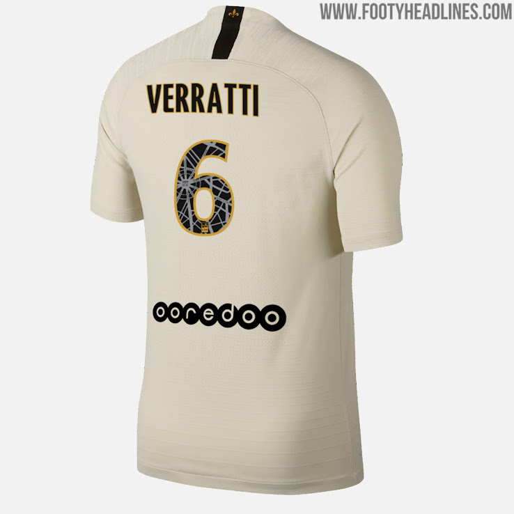
That’s on the numbers on the backFairly certain that is just another mock-up, as ours is apparently the satellite photo print template being given to all of their outfitted clubs, just in the orange and purple.

A double tie.
Nice training tops always trump the actual kits as they don’t have a big sponsor ruining the front of itTraining top for 2nd half of the season.
Based on the Manchester Bee.

That’s on the numbers on the back
Here’s Paris’ example:

Hardly representative of the fan base is it? I’ve never even heard of Hello City. And only 165 people voted for it and they probably come from the USA and Malaysia and don’t realise we’ve had navy socks for nearly double the amount of time we’ve had sky socks throughout our history
