New York City FC Kit and Badge Thread

JoeMercer'sWay said:
Personally I would make the white circle navy, with white lettering, I'd make the maroon circle gold with the central sky blue circle becoming maroon and the 2 navy ones that sandwich it being sky blue. I then would even try the central navy blue stripe being maroon as well.

wasnt sure if you meant the first one or the last one I did .... but i hope got it how you described it .... i'm not too sure tbh:

Bjb0sjlCQAAcUSK.jpg:large
 
KippaxCitizen said:
JoeMercer'sWay said:
I don't like it, but as it's Zabba I can see it being part of a Nike agenda being tested out on here.

I think a badge change is detrimental to our brand in this stage of our development.
With social media the way it is now, I think the world would be used to it within a year.

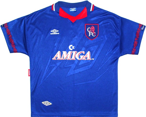
By the way, Chelsea changed their badge in 2005 from this:
chelsea_crest-86-2005.jpg


to this:
Chelsea_crest.jpg


With the first Chelsea badge there and our current one not having our club names on the badge and then changing to a proper disc with our club names on, that would be better for commercial reasons.

I think only having "MCFC" and that stupid Latin shite we have that is setting us back commercially. IMO we should have our full name on our badge.

That was the main reason I think Chelsea changed theirs (as well as fan pressure, of course).

Hard to say ... but Chelsea fans hate the Red ... they kicked up a storm when their kit had a bit of red on the back of their collar one season.

But they went from a disc to a disc, they just modernised it. If we went from our current badge to a disc, even with elements the same, it would be a complete shift of identity.
 
ZabbaStuntDouble said:
KippaxCitizen said:
JoeMercer'sWay said:
I don't like it, but as it's Zabba I can see it being part of a Nike agenda being tested out on here.

I think a badge change is detrimental to our brand in this stage of our development.
With social media the way it is now, I think the world would be used to it within a year.

By the way, Chelsea changed their badge in 2005 from this:
chelsea_crest-86-2005.jpg


to this:
Chelsea_crest.jpg


With the first Chelsea badge there and our current one not having our club names on the badge and then changing to a proper disc with our club names on, that would be better for commercial reasons.

I think only having "MCFC" and that stupid Latin shite we have that is setting us back commercially. IMO we should have our full name on our badge.

That was the main reason I think Chelsea changed theirs (as well as fan pressure, of course).

Hard to say ... but Chelsea fans hate the Red ... they kicked up a storm when their kit had a bit of red on the back of their collar one season.

But they went from a disc to a disc, they just modernised it. If we went from our current badge to a disc, even with elements the same, it would be a complete shift of identity.
That pic I posted was a disc but they had that without a disc on a number of kits including:
$T2eC16d,!)kE9s4,BM!tBRRc1Q(f+w~~60_35.JPG


$T2eC16J,!zEE9s3!(I2WBR8GzCVKLg~~60_35.JPG


Chelsea+Umbro+93+Home+Kit.jpg


Amongst others.

Good point about the red though.
 
KippaxCitizen said:
With the first Chelsea badge there and our current one not having our club names on the badge and then changing to a proper disc with our club names on, that would be better for commercial reasons.

I think only having "MCFC" and that stupid Latin shite we have that is setting us back commercially. IMO we should have our full name on our badge.

That was the main reason I think Chelsea changed theirs (as well as fan pressure, of course).

I find it very hard to believe that not having our name on our badge is setting us back. Five years ago, yes, I could totally agree. But now we are getting to the point where, even if 9 people in 10 in a foreign country support the scum, Chelsea or Arsenal, all ten know our name and recognise our badge. We may not like it at all - though opinion is clearly divided on whether the old badge would work these days - but I honestly believe that the current one is sufficiently different from every other crest out there that it's actually a very strong selling tool outside of the UK, in a way that a circular badge probably wouldn't be. Obviously nostalgia is a strong factor for those of us here, and aesthetically it may not be many peoples' cups of tea, but if you're arguing the virtues of the badge for brand recognition, I think it's actually very strong.

But seriously though, the stars need to go.
 
Falastur said:
KippaxCitizen said:
With the first Chelsea badge there and our current one not having our club names on the badge and then changing to a proper disc with our club names on, that would be better for commercial reasons.

I think only having "MCFC" and that stupid Latin shite we have that is setting us back commercially. IMO we should have our full name on our badge.

That was the main reason I think Chelsea changed theirs (as well as fan pressure, of course).

I find it very hard to believe that not having our name on our badge is setting us back. Five years ago, yes, I could totally agree. But now we are getting to the point where, even if 9 people in 10 in a foreign country support the scum, Chelsea or Arsenal, all ten know our name and recognise our badge. We may not like it at all - though opinion is clearly divided on whether the old badge would work these days - but I honestly believe that the current one is sufficiently different from every other crest out there that it's actually a very strong selling tool outside of the UK, in a way that a circular badge probably wouldn't be. Obviously nostalgia is a strong factor for those of us here, and aesthetically it may not be many peoples' cups of tea, but if you're arguing the virtues of the badge for brand recognition, I think it's actually very strong.

But seriously though, the stars need to go.

yeah Big Bird does make it stand out from the rest. in a perfect world it would be a fusion of the old and new, but alas ....
 
Falastur said:
KippaxCitizen said:
With the first Chelsea badge there and our current one not having our club names on the badge and then changing to a proper disc with our club names on, that would be better for commercial reasons.

I think only having "MCFC" and that stupid Latin shite we have that is setting us back commercially. IMO we should have our full name on our badge.

That was the main reason I think Chelsea changed theirs (as well as fan pressure, of course).

I find it very hard to believe that not having our name on our badge is setting us back. Five years ago, yes, I could totally agree. But now we are getting to the point where, even if 9 people in 10 in a foreign country support the scum, Chelsea or Arsenal, all ten know our name and recognise our badge. We may not like it at all - though opinion is clearly divided on whether the old badge would work these days - but I honestly believe that the current one is sufficiently different from every other crest out there that it's actually a very strong selling tool outside of the UK, in a way that a circular badge probably wouldn't be. Obviously nostalgia is a strong factor for those of us here, and aesthetically it may not be many peoples' cups of tea, but if you're arguing the virtues of the badge for brand recognition, I think it's actually very strong.

But seriously though, the stars need to go.
Yeah, on thinking, people will recognise the yeller chicken sticking its tongue out and the stars. As much as I don't like them, that's one of the leading things of our brand.

I really don't like it but who am I? I'm just one fan. I suppose what I think doesn't really matter.

They - and the Latin - is shite though!
 
KippaxCitizen said:
Falastur said:
KippaxCitizen said:
With the first Chelsea badge there and our current one not having our club names on the badge and then changing to a proper disc with our club names on, that would be better for commercial reasons.

I think only having "MCFC" and that stupid Latin shite we have that is setting us back commercially. IMO we should have our full name on our badge.

That was the main reason I think Chelsea changed theirs (as well as fan pressure, of course).

I find it very hard to believe that not having our name on our badge is setting us back. Five years ago, yes, I could totally agree. But now we are getting to the point where, even if 9 people in 10 in a foreign country support the scum, Chelsea or Arsenal, all ten know our name and recognise our badge. We may not like it at all - though opinion is clearly divided on whether the old badge would work these days - but I honestly believe that the current one is sufficiently different from every other crest out there that it's actually a very strong selling tool outside of the UK, in a way that a circular badge probably wouldn't be. Obviously nostalgia is a strong factor for those of us here, and aesthetically it may not be many peoples' cups of tea, but if you're arguing the virtues of the badge for brand recognition, I think it's actually very strong.

But seriously though, the stars need to go.
Yeah, on thinking, people will recognise the yeller chicken sticking its tongue out and the stars. As much as I don't like them, that's one of the leading things of our brand.

I really don't like it but who am I? I'm just one fan. I suppose what I think doesn't really matter.

They - and the Latin - is shite though!

Every fan matters ... hence the Manc Spring is Rising lol
 
ZabbaStuntDouble said:
JoeMercer'sWay said:
Personally I would make the white circle navy, with white lettering, I'd make the maroon circle gold with the central sky blue circle becoming maroon and the 2 navy ones that sandwich it being sky blue. I then would even try the central navy blue stripe being maroon as well.

wasnt sure if you meant the first one or the last one I did .... but i hope got it how you described it .... i'm not too sure tbh:

Bjb0sjlCQAAcUSK.jpg:large

Yhp, I like the 2nd one, I know the maroon with the MCFC doesn't look as good as the navy but I think the sky blue and maroon hoop looks better than the navy and sky blue but I don't think a maroon hoop and navy blue central stripe would look as good but I don't know, I think the navy and white with the gold stripe around the outside looks much better than the white hoop.
 
JoeMercer'sWay said:
ZabbaStuntDouble said:
JoeMercer'sWay said:
Personally I would make the white circle navy, with white lettering, I'd make the maroon circle gold with the central sky blue circle becoming maroon and the 2 navy ones that sandwich it being sky blue. I then would even try the central navy blue stripe being maroon as well.

wasnt sure if you meant the first one or the last one I did .... but i hope got it how you described it .... i'm not too sure tbh:

Bjb0sjlCQAAcUSK.jpg:large

Yhp, I like the 2nd one, I know the maroon with the MCFC doesn't look as good as the navy but I think the sky blue and maroon hoop looks better than the navy and sky blue but I don't think a maroon hoop and navy blue central stripe would look as good but I don't know, I think the navy and white with the gold stripe around the outside looks much better than the white hoop.

not easy is it? lol there is one i'm thinking about but havent tried it yet ... more maroon involved .... but i must do my Tesco order first ... i must .... lol

BjcX7NWCMAAscW7.jpg:large
 
We're selling a NYCFC logo shirt now online but of course it's not the adidas ones. Makes it a decent price though, good idea to drum up support only £13 but it is just a basic shirt you could get printed yourself
 
M24 Citizen said:
We're selling a NYCFC logo shirt now online but of course it's not the adidas ones. Makes it a decent price though, good idea to drum up support only £13 but it is just a basic shirt you could get printed yourself

not for me thanks.
 
JaviGarciaShow said:
Golden rule. Don't fix when it's not broken. Current one is much better than these.
The three ridiculous stars, United's 1958 FA Cup final yellow chicken, the stupid Latin shite...i disagree with you!
 

Don't have an account? Register now and see fewer ads!

SIGN UP
Back
Top