New York City FC Kit and Badge Thread

M24 Citizen said:
Sigh said:
M24 Citizen said:
The 20th legion? Fuck sake. I was trying to remember where the manchester eagle comes from the other day and I can't stand the bastard romans.

Are you sure it comes from that?

When the design was revealed everyone said WTF? And that was the story behind the design. Some lady archaeologist was interviewed and there were pics of excavations and so on. It seemed tenuous to me then, and hasn't improved with age imo. The fact that hardly anyone gets it seems to me to be clear and convincing evidence it has failed of its essential purpose, i.e. to root Manchester (City) in "history".

FAIL, imo. Get rid. Why don't we switch the eagle and stars for a three flint arrowheads and stone megalith?

I'm sure I've read somewhere something from Gary James about the rags actually using the eagle before us
Beyond me that. I just spent ten minutes though looking at images of Manchester's arms from early 1800s to date, on buildings, inside buildings stained glass, pottery, regalia, badges (including on cup final shirts during the 1950s) and there's not a bird in sight. Could've missed it though.
 
This is why I've never liked it:
Shirt2.jpg

The Rags 1958 FA Cup final shirt.

I'd rather get rid of that, the silly stars and the Latin shite. But will the Sheikh care what I want? I doubt it!
 
"In 1958 the first official crest was issued by the City, this included the often missed Helm and Mantling. It added in the Mantling a Golden Eagle on a Crown. The Eagle was included to represent the importance of the Aero Industry and the crowns represent the enlarging community of Manchester."

<a class="postlink" href="http://www.manchester.gov.uk/info/448/archives_and_local_history/4118/manchester_city_council_crest_in_to_the_future" onclick="window.open(this.href);return false;">http://www.manchester.gov.uk/info/448/a ... the_future</a>
Clear information from where the eagle has come from, also in conjunction with the Roman links!

Back to NYCFC, interesting they have Adidas and not Nike...
 
Tell The King said:
"In 1958 the first official crest was issued by the City, this included the often missed Helm and Mantling. It added in the Mantling a Golden Eagle on a Crown. The Eagle was included to represent the importance of the Aero Industry and the crowns represent the enlarging community of Manchester."

<a class="postlink" href="http://www.manchester.gov.uk/info/448/archives_and_local_history/4118/manchester_city_council_crest_in_to_the_future" onclick="window.open(this.href);return false;">http://www.manchester.gov.uk/info/448/a ... the_future</a>
Clear information from where the eagle has come from, also in conjunction with the Roman links!

Back to NYCFC, interesting they have Adidas and not Nike...

The rag shirt posted above has a clear resemblance to the legion's eagle and clearly the fort but for us I'll take the excuse about the Aero industry for using it. The lion's crown on the Manchester coat of arms is actually fashioned in resemblance to the fort as well
 
Tell The King said:
"In 1958 the first official crest was issued by the City, this included the often missed Helm and Mantling. It added in the Mantling a Golden Eagle on a Crown. The Eagle was included to represent the importance of the Aero Industry and the crowns represent the enlarging community of Manchester."

<a class="postlink" href="http://www.manchester.gov.uk/info/448/archives_and_local_history/4118/manchester_city_council_crest_in_to_the_future" onclick="window.open(this.href);return false;">http://www.manchester.gov.uk/info/448/a ... the_future</a>
Clear information from where the eagle has come from, also in conjunction with the Roman links!

Back to NYCFC, interesting they have Adidas and not Nike...
Adidas have a contract with the MLS and all MLS teams' kits are made by Adidas.
 
KippaxCitizen said:
Tell The King said:
"In 1958 the first official crest was issued by the City, this included the often missed Helm and Mantling. It added in the Mantling a Golden Eagle on a Crown. The Eagle was included to represent the importance of the Aero Industry and the crowns represent the enlarging community of Manchester."

<a class="postlink" href="http://www.manchester.gov.uk/info/448/archives_and_local_history/4118/manchester_city_council_crest_in_to_the_future" onclick="window.open(this.href);return false;">http://www.manchester.gov.uk/info/448/a ... the_future</a>
Clear information from where the eagle has come from, also in conjunction with the Roman links!

Back to NYCFC, interesting they have Adidas and not Nike...
Adidas have a contract with the MLS and all MLS teams' kits are made by Adidas.

Thank you!
 
IanBishopsHaircut said:
Ban-jani said:
nyc-fc-circular-badge.png


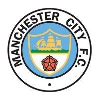
Now give us our badge back please...

RetroCrest.jpg

Maybe we could have a rebranding

The eagle less the stars in a circular old school city badge
speak for your self ,the old badge was a constant,in a time off nothing but shitness, its cheap looking ,a red rose of lancs,what the f***k is that all about ,thank f**K our owners agree ,..........
 
Full page ad in the paper today announcing New York City Football Clubs arrival. Well, arrival in 2015.

Still have NO IDEA where they will play! Thats an issue.
 
ped said:
IanBishopsHaircut said:
Ban-jani said:
nyc-fc-circular-badge.png


Now give us our badge back please...

RetroCrest.jpg

Maybe we could have a rebranding

The eagle less the stars in a circular old school city badge
speak for your self ,the old badge was a constant,in a time off nothing but shitness, its cheap looking ,a red rose of lancs,what the f***k is that all about ,thank f**K our owners agree ,..........

anything could happen .....

mcfc-crests_zps1b6e3374.jpg
 
Sigh said:
M24 Citizen said:
Sigh said:
When the design was revealed everyone said WTF? And that was the story behind the design. Some lady archaeologist was interviewed and there were pics of excavations and so on. It seemed tenuous to me then, and hasn't improved with age imo. The fact that hardly anyone gets it seems to me to be clear and convincing evidence it has failed of its essential purpose, i.e. to root Manchester (City) in "history".

FAIL, imo. Get rid. Why don't we switch the eagle and stars for a three flint arrowheads and stone megalith?


I'm sure I've read somewhere something from Gary James about the rags actually using the eagle before us
Beyond me that. I just spent ten minutes though looking at images of Manchester's arms from early 1800s to date, on buildings, inside buildings stained glass, pottery, regalia, badges (including on cup final shirts during the 1950s) and there's not a bird in sight. Could've missed it though.

It's all covered in my book Manchester A Football History and I'm sure I've written about it on Bluemoon. The eagle was introduced in 1957 and appeared on Utd shirts in the 58 final (often incorrectly said to be a Phoenix by MUFC fans and the BBC). Both Utd (on these shirts) & City (on handbooks) used the same badge at times during late 50s & early 60s. Here's the badge on a Utd shirt - <a class="postlink" href="http://www.camporetro.com/siteimg/prodhires/2802-131.jpg" onclick="window.open(this.href);return false;">http://www.camporetro.com/siteimg/prodh ... 02-131.jpg</a>
 
ZabbaStuntDouble said:
ped said:
IanBishopsHaircut said:
Maybe we could have a rebranding

The eagle less the stars in a circular old school city badge
speak for your self ,the old badge was a constant,in a time off nothing but shitness, its cheap looking ,a red rose of lancs,what the f***k is that all about ,thank f**K our owners agree ,..........

anything could happen .....

mcfc-crests_zps1b6e3374.jpg

Funny thing about the ship on our iconic badge and in those very nice mock-ups . . .

The flags are blowing in opposite directions.

Typical City indeed.
 
Kin ell I'd take any one of those circular ZSD designs as our new crest in a bloody heart beat. They're brill they are.
 
M24 Citizen said:
Why Always Ste said:
No, no shirt unveiling although you will be able to buy merchandise off the club store.

Looks like the shirt will be Adidas.

Be even better if our shirt was also Adidas :)
Noooo. I like Adidas more than Nike but I wouldn't like a City shirt with the 3 stripes on the arms.

Wouldn't the 3 stripes reflect the 3 stripes (rivers) on our badge?
 
IrelandSuperman said:
Kin ell I'd take any one of those circular ZSD designs as our new crest in a bloody heart beat. They're brill they are.

Definitely. I would absolutely support any rebranding that resulted in us getting that crest in the bottom right. It's brilliant.
 
ZabbaStuntDouble said:
ped said:
IanBishopsHaircut said:
Maybe we could have a rebranding

The eagle less the stars in a circular old school city badge
speak for your self ,the old badge was a constant,in a time off nothing but shitness, its cheap looking ,a red rose of lancs,what the f***k is that all about ,thank f**K our owners agree ,..........

anything could happen .....

mcfc-crests_zps1b6e3374.jpg

How about Melbourne City?, they won't stay Heart.
 
gouldybob said:
ZabbaStuntDouble said:
ped said:
speak for your self ,the old badge was a constant,in a time off nothing but shitness, its cheap looking ,a red rose of lancs,what the f***k is that all about ,thank f**K our owners agree ,..........

anything could happen .....

mcfc-crests_zps1b6e3374.jpg

How about Melbourne City?, they won't stay Heart.

Given that there already exist a lower league Melbourne City FC that also claim the TM now since City came around the authorities refuse to give any party the rights to the name.. Which in most peoples eye is a way of telling both clubs to either get an agreement or none of you will have the TM.
 
Just to be clear on the Melbourne City thing; when they say "lower league" they don't mean like Bradford City, they mean like a pub team.

There's no way we aren't getting that trademark
 
Damocles said:
Just to be clear on the Melbourne City thing; when they say "lower league" they don't mean like Bradford City, they mean like a pub team.

There's no way we aren't getting that trademark

Unfortunately, that's not the way the trademark system works. We can't just automatically steal the name of something that has existed for years already, just because we are big and they are small. You'll note that the Australian courts have already rejected our application to take the name...
 
I was meaning more along the lines of we're an international brand with billions of dollars behind us and they're a couple of part timers who play footy on the weekend. We'll buy them out either financially or by incorporating them into the club/allowing them to use facilities and the like.
 
Damocles said:
IrelandSuperman said:
Kin ell I'd take any one of those circular ZSD designs as our new crest in a bloody heart beat. They're brill they are.

Definitely. I would absolutely support any rebranding that resulted in us getting that crest in the bottom right. It's brilliant.

Could also do what the folks did with the Arab Spring ..... start using it as your MCFC crest, then when enough people use it, everyone will start to assume its the real thing. A 'Manc Spring' if you will ...... so here you go .....

revolution-spring_zpsd096fab2.png


Viva La Revolution!! lol
 

Don't have an account? Register now and see fewer ads!

SIGN UP
Back
Top