Centurions
Well-Known Member
A few M10 rawlplugs and jobs a good 'un.I can’t quite get my head around the engineering involved in joining the old stand with the new!!
A few M10 rawlplugs and jobs a good 'un.I can’t quite get my head around the engineering involved in joining the old stand with the new!!
Looks like cheap kitchen worktops!
He should stick to talking about farmingMet an Ipswich fan in the Metrolink queue after the game. He claimed that we were building the stand on rollers and would push it forward when finished. He was adamant he was right.
They need a better bricky because that wall is shocking. My bricky dad would be fuming with that if was still alive.The brick.
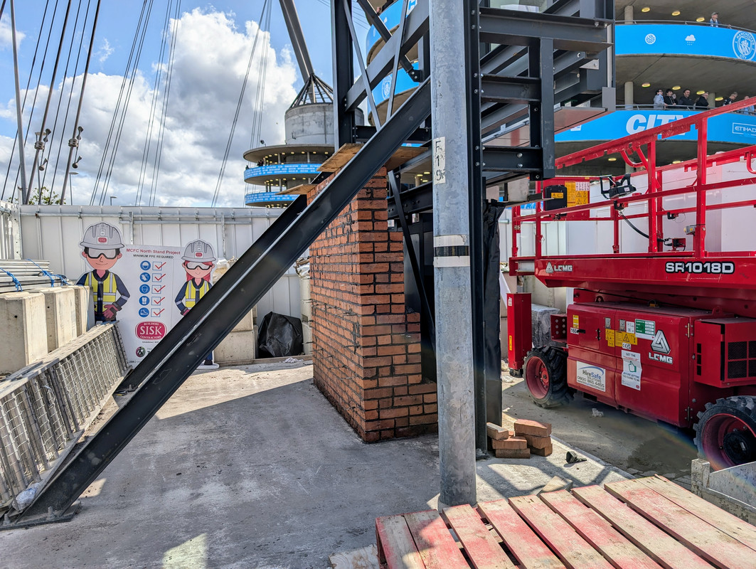
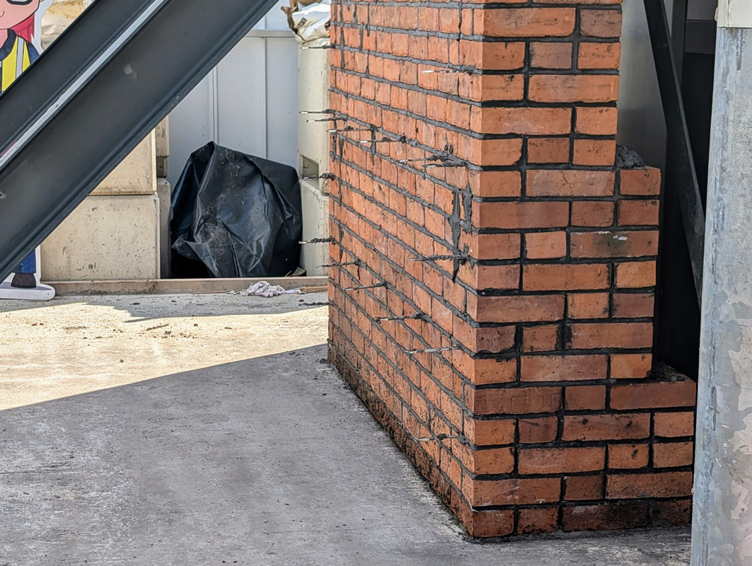
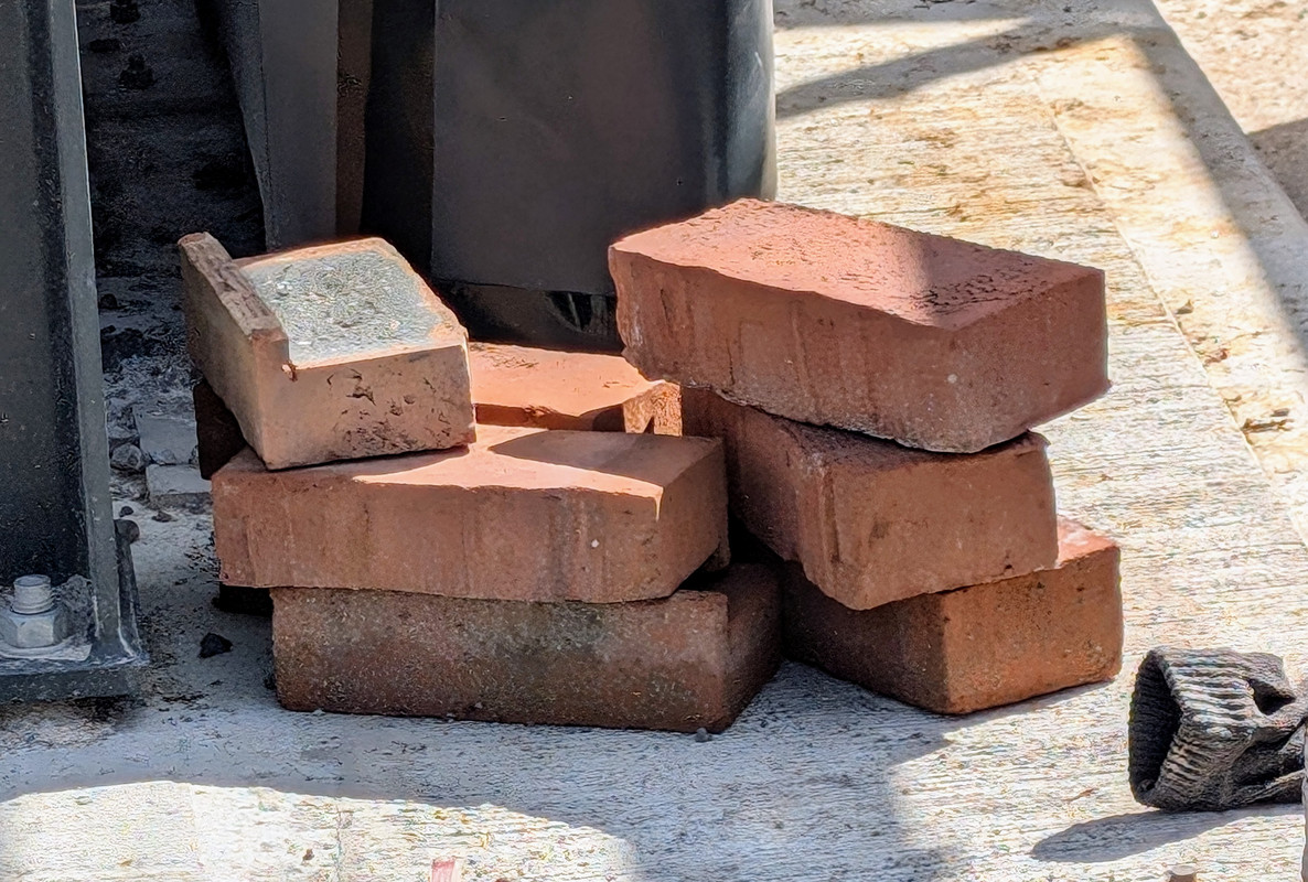
The exterior brick/s?
The name of the brick is Springwell Red.
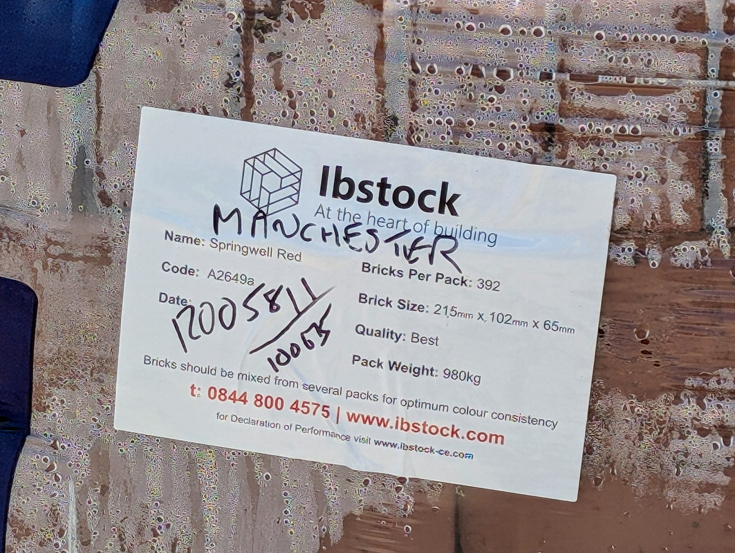
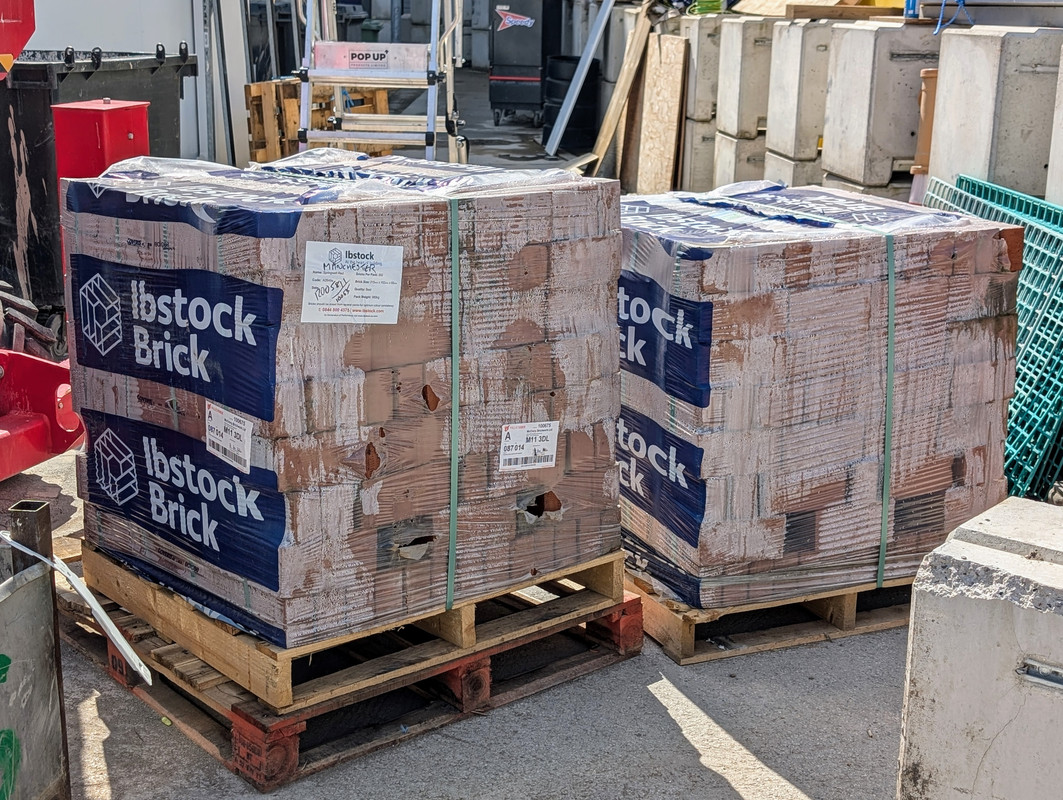
Ibstock doesn't list Springwell Red on their website. It isn't coming up in search.
Taylor Maxwell do.

They need a better bricky because that wall is shocking. My bricky dad would be fuming with that if was still alive.

Don’t laugh. :-)
Any thoughts on the exterior brick chosen?
I’m no brick expert, but it looks modern, smooth and clean looking.
I was pretty amazed by the different choices of brick available when searching the internet for that spercific brick. How on earth Populous and the club decided on that specific brick is beyond me. I’d have thought a very pale blue brick to tie in with the clubs colours and the white hotel extrior would have been a better idea.

