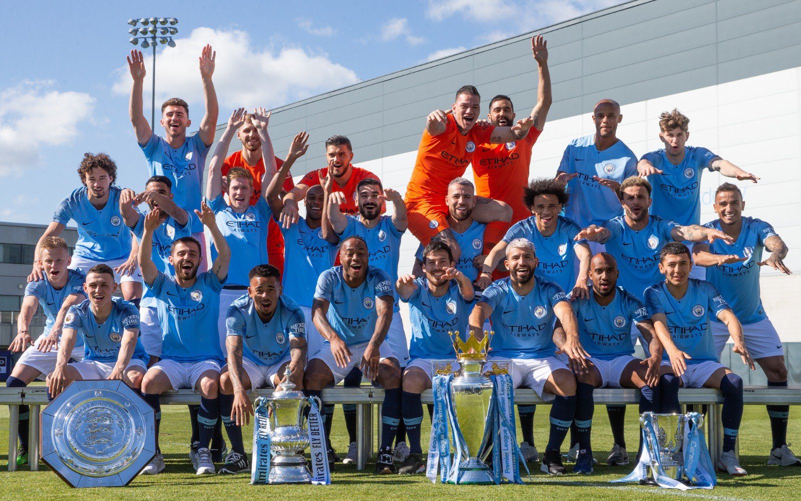
Team photo with 4 trophies

tremendous picture ,

by the look of the shadow on this picture the sun is coming over their errrm shoulders :)
Look at the shadows on the trophies and footballs on the 1969 photo, the Sun is coming from in front of them (from around 45°), there’s barely any shadow on a player’s face or shirt and you can see the trophies clearly.

These new pics are done very poorly. The trophies, the players’ faces or the sky blue of the kit don’t stand out at all.
 
Last edited by a moderator:
Those photos are great, the quality of them is terrible though.

No comparison to this:
BOlFzYu.jpg


Can’t see the trophies properly and the shadows cover half of their faces and kit fronts in the modern ones.

They should be facing the Sun, not have it over their shoulders.

The black boots are key imo. They have their full work gear on. It's iconic. (And the correct sock turnover helps).
Wearing trainers in the new one is so wrong. Scruffy twats ;)
 
Those photos are great, the quality of them is terrible though.

No comparison to this:
BOlFzYu.jpg


Can’t see the trophies properly and the shadows cover half of their faces and kit fronts in the modern ones.

They should be facing the Sun, not have it over their shoulders.

Love how the goalkeepers shirts don’t even match.
 
Love how the goalkeepers shirts don’t even match.

I don’t think that they could tell Harry Dowd what to do much, apparently he was more interested in his scrap metal business.

There are a number of team photos with Harry, Big Joe and Ken Mulhearn and there’s one with Alan Ogley (2 apps in 67-68 championship winning season) as well and in each photo Harry has a crew neck collar and the rest Polo type collars.

The crew neck is there even to the extent that he occasionally had a yellow crew neck, green shirt and white cuffs. (Don’t think it’s the scanning of the photo cos seen a couple of photos with same shirt.
 
Look at the shadows on the trophies and footballs on the 1969 photo, the Sun is coming from in front of them (from around 45°), there’s barely any shadow on a player’s face or shirt and you can see the trophies clearly.

These new pics are done very poorly. The trophies, the players’ faces or the sky blue of the kit don’t stand out at all.

Couldn't agree more. My first reaction was 'What a shit photo.' Absolute mess of light and shade, every crease and bump emphasized by the bright low morning sun and the trophies are literally and figuratively placed in the shade. If that was the only time they could do it, they should have tried a different setup or done it inside where they could control the light. You've also got the photographic problem of white and black players in the same picture. You have to be very careful with settings and light or you get either overexposed white faces or underexposed black ones. I'd doubt that a professional photographer would submit a disaster like that for publication. There's no way that should ever be considered a definitive record of such a unique achievement. Do it again City for God's sake.
 

Don't have an account? Register now and see fewer ads!

SIGN UP
Back
Top
  AdBlock Detected
Bluemoon relies on advertising to pay our hosting fees. Please support the site by disabling your ad blocking software to help keep the forum sustainable. Thanks.