You are using an out of date browser. It may not display this or other websites correctly.
You should upgrade or use an alternative browser.
You should upgrade or use an alternative browser.
Umbro T-Shirt comp...
- Thread starter Ant-emilydesign
- Start date
JoeMercer'sWay
Well-Known Member
alky313 said:JoeMercer'sWay said:the black scares me after the rumours about our home shirt.
What you talking bout JMW?
there was just a thread a few weeks back saying our home kit would have a black badge and black trim, just hoping they were talking out their arses as usual.
I've got no insider knowledge so don't panic ;).
BlueBlood84
Well-Known Member
Not a bad effort at all.
If I'd have known about the comp I would have entered some of the I Bleed Blue designs. (currently on sale by the way...cheap as chips! Search I Bleed Blue on ebay to see them!)
If I'd have known about the comp I would have entered some of the I Bleed Blue designs. (currently on sale by the way...cheap as chips! Search I Bleed Blue on ebay to see them!)
MCC
Well-Known Member
Ant-emilydesign said:http://www.mcfc.co.uk/Home/News/Club%20news/Umbro%20tees
Mine didn't make the final 5, but worked hard on it so thought id put it up here...

Hope you like.
Gave 'Andrew' my vote
Here is a close up,

Superb T-shirt. Out of the blue and into the black.
Johnny Rotten.......
[youtube]http://www.youtube.com/watch?v=0O1v_7T6p8U&feature=related[/youtube]
inGavious
Well-Known Member
JoeMercer'sWay said:alky313 said:JoeMercer'sWay said:the black scares me after the rumours about our home shirt.
What you talking bout JMW?
there was just a thread a few weeks back saying our home kit would have a black badge and black trim, just hoping they were talking out their arses as usual.
I've got no insider knowledge so don't panic ;).
its basically this:

and I got a stern email from Umbro asking how I came up with the design?
was going to enter this, till i read the terms that said you hand all rights over to umbro and only get a set of match tickets in return and thought ... feck off:

A
A
Anonymous
Guest
inGavious said:JoeMercer'sWay said:alky313 said:What you talking bout JMW?
there was just a thread a few weeks back saying our home kit would have a black badge and black trim, just hoping they were talking out their arses as usual.
I've got no insider knowledge so don't panic ;).
its basically this:
and I got a stern email from Umbro asking how I came up with the design?
not a dig at you ingavious as you're quality at those designs but.... if that's next years kit or v similar i'm kicking off.
inGavious
Well-Known Member
ban-mcfc said:inGavious said:JoeMercer'sWay said:there was just a thread a few weeks back saying our home kit would have a black badge and black trim, just hoping they were talking out their arses as usual.
I've got no insider knowledge so don't panic ;).
its basically this:
and I got a stern email from Umbro asking how I came up with the design?
not a dig at you ingavious as you're quality at those designs but.... if that's next years kit or v similar i'm kicking off.
i've already kicked off regardless ;)
inGavious
Well-Known Member
Ant-emilydesign said:http://www.mcfc.co.uk/Home/News/Club%20news/Umbro%20tees
Mine didn't make the final 5, but worked hard on it so thought id put it up here...
so u saying between 76 and when the sheiks took over, it was 32 years of dark times?? thats like forgetting the good times with the dark times in that period and forgetting everyone that worked, played or helped City in that period.
can see what you were trying to do, but kinda painted a picture that we were nothing good, now we are something good.
maybe "out of the blue ... six past the red" would have been more positive ;)
nu774ll
Well-Known Member
Can't believe the OP's didnt make it in the top 5, thats a class effort - you should get them printed up yourself i reckon!
Here was my attempt:
Here was my attempt:
I heard mention in another thread a while back of a bluemoon t-shirt competition,nothing seems to of come of it but it was a good idea,there are some talented designers on here and i am sure the winning entry would sell well and pay off some of the server costs.
kunaguero10
Well-Known Member
- Joined
- 16 May 2009
- Messages
- 7,745
Oh yeah sorry i originally read it as saying 1876. But my point remainsBlueGeorge said:I disagree, as it only states from '76 which I think makes it so good. And is pretty much correct toohateutd said:Agreed with mansour's tow ropes.....Some respect for our history,we r not glory hunters!
Ant-emilydesign
Well-Known Member
MCC said:Superb T-shirt. Out of the blue and into the black.
Johnny Rotten.......
[youtube]http://www.youtube.com/watch?v=0O1v_7T6p8U&feature=related[/youtube]
Well spotted - Neil Young sings it too, which was my reference.
Wasn't trying to say them 30 odd years were dark times, had some amazing days during that time.
inGavious
Well-Known Member
probably wasnt selected cos its a rasterised image which is a buggar to put on a shirt and we all know that Umbro don't want overheads more than 50p a shirt.
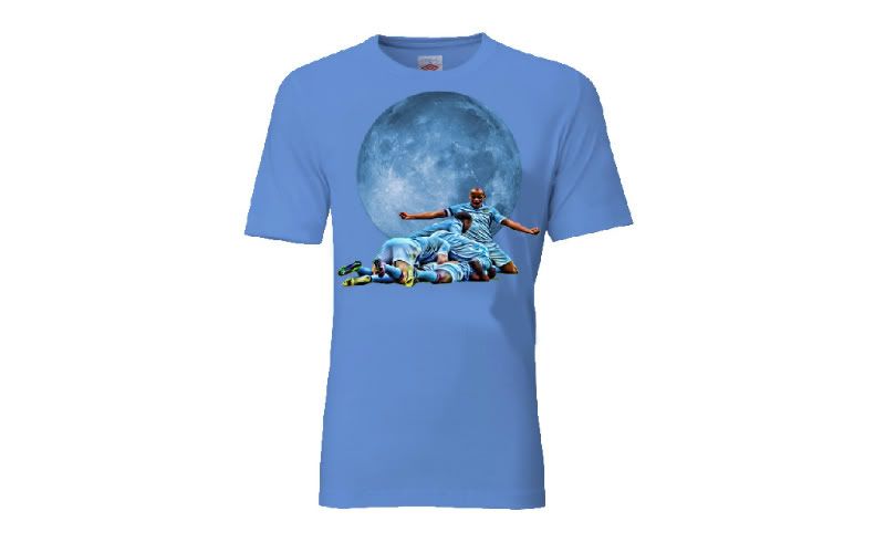
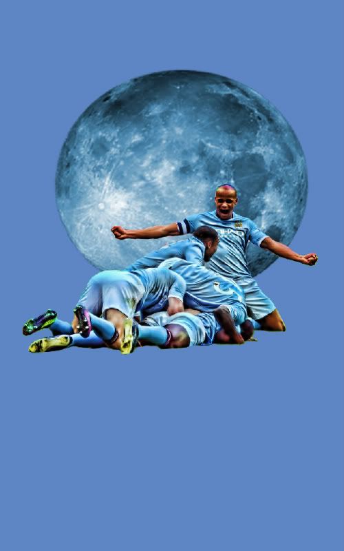
i tried to put a raterised image into a t-shirt once and it was weeded into the fabric instead of like being a transfer. Dunno if that was just the manufacturer doing that or what they had to do. and it came out smaller than i wanted, so now i just do super big images so they fit the whole shirt. like this:

and it comes out that big and as a transfer on top of the material instead of being being printed into it. but tbh ... dont know how it all works tbh.
i tried to put a raterised image into a t-shirt once and it was weeded into the fabric instead of like being a transfer. Dunno if that was just the manufacturer doing that or what they had to do. and it came out smaller than i wanted, so now i just do super big images so they fit the whole shirt. like this:
and it comes out that big and as a transfer on top of the material instead of being being printed into it. but tbh ... dont know how it all works tbh.
inGavious
Well-Known Member
Ant-emilydesign said:daveduke67 said:I must say I'd struggle to pick one of those if I was offered a free one.
Maybe the designers at Umbro chose the finalists and ignored the good ones so as to keep them in a job. Someone higher up could have seen the real quality ones and thought 'why are we paying these designers so much when we can get people to do it for a free t-shirt and bragging rights. Sack 'em'
-- Tue Mar 20, 2012 6:29 pm --
kun said:These where my attempts that didn't make (P.S. I know they are Shite)
BtW the OP's effort definitely deserved to be in the top 5 at least!
I'm guessing that you didn't stay within the red box had a lot to do with it as well.
On a similar note, my friend had to sort through hundreds of job applications every year. Well over half were binned without her even reading them as the applicants simply hadn't followed the instruction 'Black ink and capitals only'. Looks like you fell into the same trap ;-)
Fair point.
Tho that first one, Andrews its much longer than the square too.
the redbox isnt that important, its a guide only, things can be done outside, just means extra QC on each shirt cos on seams or sleeve joints or collars etc, so if you have it in all in the centre, they dont need the QC.<br /><br />-- Wed Mar 21, 2012 10:56 am --<br /><br />
Niall2407 said:My vote went to Andrew, not keen on square prints on t-shirts but his looked really good
who's the Oakes and Doyle on it meant to be??
Cozmo Bozo
Well-Known Member
- Joined
- 25 Apr 2009
- Messages
- 223
Cocked up the latin phrase tho.Niall2407 said:My vote went to Andrew, not keen on square prints on t-shirts but his looked really good
Oyster28catcher
Well-Known Member
- Joined
- 3 Jul 2010
- Messages
- 7,636
- Location
- https://acton28.blog/
- Team supported
- CITY/Aberystwyth Town
nu774ll said:Can't believe the OP's didnt make it in the top 5, thats a class effort - you should get them printed up yourself i reckon!
Here was my attempt:
CLASS, the Original poster one looks more like a movie poster or programme cover... very good design mind