D
D
Deleted member 77198
Guest
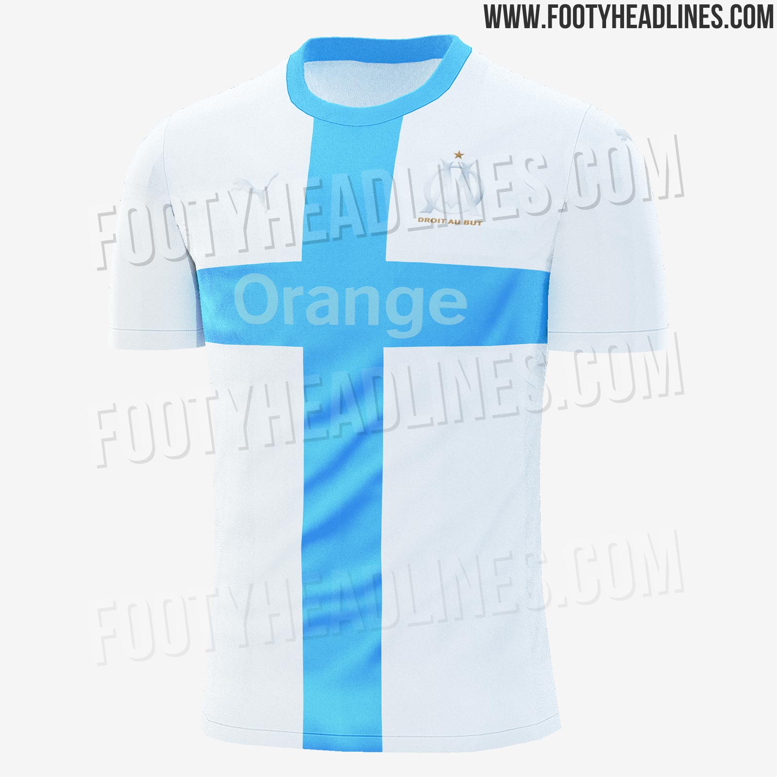
Marseille’s 120 year anniversary kit (I never knew 120 years was an anniversary to celebrate to be honest!)
So I can see our 125th anniversary kit being just as simple. Might even be just pure sky blue with an understated badge and sponsor
So I can see our 125th anniversary kit being just as simple. Might even be just pure sky blue with an understated badge and sponsor


