burning blue soul
Well-Known Member
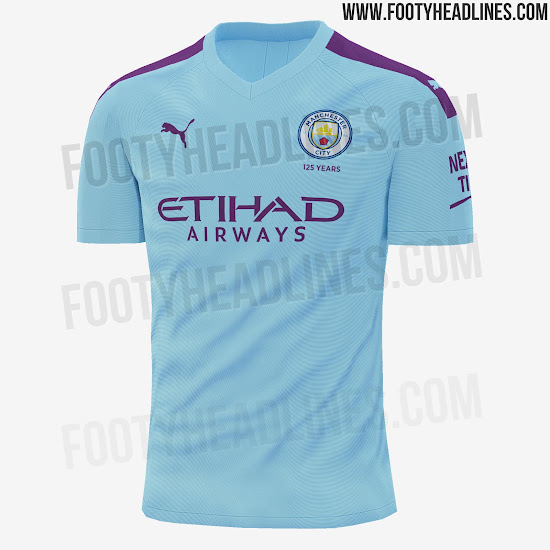
Fuckin great, so we have city, west ham, Burnley and villa all playing in claret and blue next season!!!
So much for individuality and self expression then!!! :(
So much for individuality and self expression then!!! :(