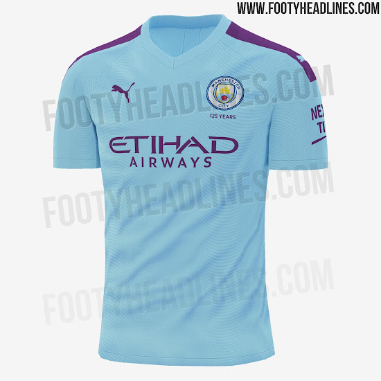
Is purple bad on a city home kit? Err yes it is.
I don’t give a shit
I’m colour blind [emoji23][emoji23]
Is purple bad on a city home kit? Err yes it is.
Going out on a limb again, and knowing this may be an unpopular opinion, but I thought Pep looked a bit of a div in that horrible flat cap.
(takes cover)
I concur. I'm not against change for the right reasons but i think this is unnecessary.
I love our white and sky blue and those colors are our brand at the most basic fundamental.
shivers run down my spine when we wear it and it's warming like seeing an old friend, walking through your front door after a long shitty flight, or a splash of single malt.
the reasoning of this year not having our home kit being similar to the 125th kit doesn't wash with me. If the designers can't come up with a nice modern design as well as a distinctive beauty of a commemorative kit using the same colors then i think a lot of parents wasted some tuition money.
Going even further I think we should wear the sky blue on the road as much as possible as long as it doesn't clash with the home team. this was the only reason for a "change strip" in the past and i think we should get back to that. but of course it's all about the revenue further proven by the introduction of the third jersey.
YesThe one he wore out of respect to Bernard Halford?
Going out on a limb again, and knowing this may be an unpopular opinion, but I thought Pep looked a bit of a div in that horrible flat cap.
(takes cover)
They did sell the tartan scarves, not sure if they still do.Loved that flatcap, a very nice tartan too, club should sell them, I would buy it
full kit and flat cap on the beach, perfectNeed to see it with the shorts & socks. Shirt looks OK on the footyheadlines pictures.
I reckon the full kit will look pretty smart.
Topped off with a Pep cardie. Lovely.full kit and flat cap on the beach, perfect
Topped off with a Pep cardie. Lovely.
Fashion tips on Bluemoon - nice.

is that you - nice bins.
Firminho?
Don’t forget the inflatable banana!Topped off with a Pep cardie. Lovely.
As it’s our 125th year then what was the kit 125 years ago? Couldn’t we just have revamped that???

I'd buy that - better than the season just gone!I’d say this was better than every single Nike home shirt except the 17/18 one.
It’s also better than the 11/12 & 12/13 Umbro home shirts imo.

