Cellarite
Well-Known Member
- Joined
- 12 Jan 2010
- Messages
- 26,763
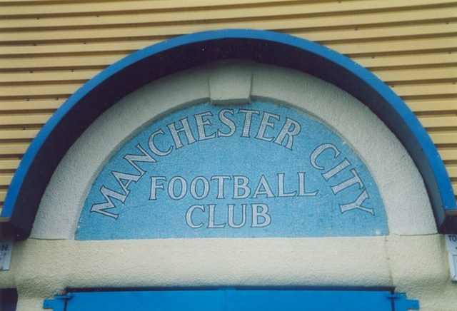
- Team supported
- Manchester City
Whereas I own about 8 books about the history of football kits. I liked Denmark’s in 86 but I didn’t cry when I didn’t like Scotland’s in 96. I just like football kits.I get that fella but don’t get all the moaning about it they could wear a spud sack for all I care as long as they football and results are good that’s all that matters.