HelloCity
Well-Known Member
I usually love the red and black shirts but i can't bring myself to like that
That’s a fake although the real deal does look pretty close.
I usually love the red and black shirts but i can't bring myself to like that

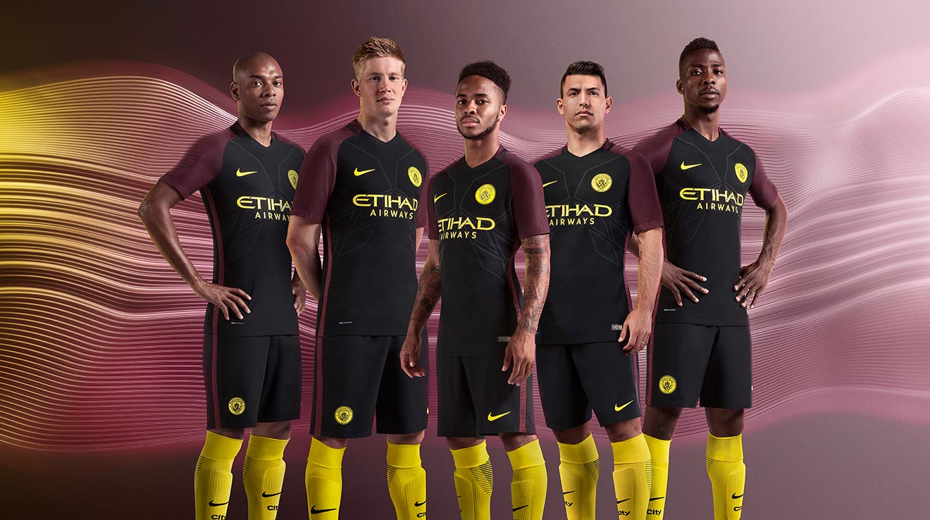
I’m one who agrees with those complaints. Can’t be doing with City in red. Never liked any red+black stripes, sash, or checks.I think it’s a great kit. If you hear anyone who doesn’t get the significance of maroon to City tell them to have a look at this piece I posted back in November of the consternation when maroon was replaced by red/black stripes:
https://gjfootballarchive.com/2021/11/30/complaints-about-mcfc-kits/
I’ve seen some on social media question why maroon. Truth is it’s City’s traditional away colour and has been used for numbers on shirts, trim on shorts and on socks of course.


I’m one who agrees with those complaints. Can’t be doing with City in red. Never liked any red+black stripes, sash, or checks.
Maroon is City away.
View attachment 43803
View attachment 43804
Any sash should be Sky and navy.
View attachment 43805
Stripes or hoops should be yellow and black (Mcr bee).
I’d also like to see City in some of the yellow strips with maroon trim from the early 60s.
View attachment 43802
Throw in a nice purple, a nice orange kit, and a nice white kit now and again and we should ever need to go near fucking red!
A heartwarming video for sure.Try not to cry you soft fuckers:

COLIN BELL'S FAMILY SEE NEW HOME KIT | To coincide with the launch of the Colin Bell inspired 22/23 home shirt, we invited The King’s family to the Etihad to see it for the very first time! | By Manchester City | Facebook
To coincide with the launch of the Colin Bell inspired 22/23 home shirt, we invited The King’s family to the Etihad to see it for the very first time!fb.watch
I don't get the maroon on the shirt and that ship looks like a Blue Peter badge
At least we'll be wearing white shorts
happy to help.I think it’s a great kit. If you hear anyone who doesn’t get the significance of maroon to City tell them to have a look at this piece I posted back in November of the consternation when maroon was replaced by red/black stripes:
https://gjfootballarchive.com/2021/11/30/complaints-about-mcfc-kits/
I’ve seen some on social media question why maroon. Truth is it’s City’s traditional away colour and has been used for numbers on shirts, trim on shorts and on socks of course.
Agreed... bloody awful kitThis was a shocker
There a good short video advert at Manchester Victoria station by the ticket barriers, if your up that way, it’s probably at loads of other locations tooA heartwarming video for sure.
I'll check Carlisle station but I'm not confident it will have arrived this far north lolThere a good short video advert at Manchester Victoria station by the ticket barriers, if your up that way, it’s probably at loads of other locations too
I think it’s a great kit. If you hear anyone who doesn’t get the significance of maroon to City tell them to have a look at this piece I posted back in November of the consternation when maroon was replaced by red/black stripes:
https://gjfootballarchive.com/2021/11/30/complaints-about-mcfc-kits/
I’ve seen some on social media question why maroon. Truth is it’s City’s traditional away colour and has been used for numbers on shirts, trim on shorts and on socks of course.
I understand the historical element of maroon on an away kithappy to help.
The kit is a tribute to King ColinI understand the historical element of maroon on an away kit
The "Brother" striped shirt from around 1987/88 I thought was a thing of beauty and I bought the shirt of the all maroon kit from the following year
Home shirt should be sky or oxford blue and white. Yes dark blue sponsor and numbers, but leave the maroon off the home shirts
As I said, I really don't get/understand maroon on a home shirt

A shirt similar to the 125 year anniversary shirt would have been more appropriate IMOThe kit is a tribute to King Colin
I see maroon on the socks, so I guess the maroon trim is a tribute to that strip.
Well I guess you are just not going to be happy so have a great evening :)A shirt similar to the 125 year anniversary shirt would have been more appropriate IMO
I intend to have a magnificent weekend as I hope and believe we ALL willWell I guess you are just not going to be happy so have a great evening :)
Well I guess you are just not going to be happy so have a great evening :)
