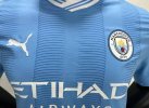
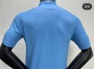
City’s New Kits

I think the lines are meant to invoke the spirals on the Etihad
That’s a new one! :-)

It’s a printed shadow stripe, so they can save cash on the material, but give it the same look as the throwback kit it uses as it’s inspiration.
 
That’s a new one! :-)

It’s a printed shadow stripe, so they can save cash on the material, but give it the same look as the throwback kit it uses as it’s inspiration.
It's only because:

a. It's a kit celebrating 20 years of the Etihad Stadium
b. if you look carefully the horizontal stripes curve round at each end to look like circles
 
my-11134201-23030-vg94a7pjidovcc
 
What? The photos of the obviously fake away kit? The one that doesn't even have a puma logo?

Anyone who's had any info about the home kit say it's white shorts.
Oh yeah hadn’t notice the lack of a puma logo. However, I wouldn’t put it past City to go with blue shorts, especially when the kit is also a bit SAAB esque.
 
They make the shirt APPEAR to have a shadow stripe in the material, without the expense of spinning the shadow stripe into the material!

I think it is a modern update on a classic, and given it’s Puma, not Umbro, I like it FAR MORE than some of their efforts, including that white abomination they’re showing!

Fuck me that “new” white shirt is gash!!

I don’t mind white as a second shirt, and we had a wonderful white shirt, navy shorts, white socks kit very recently. But, are they simply tone deaf to the FACT that City fans are DESPERATE for a white shirt with a single (or double) stripe on the front, be it vertical or the diagonal sash???

And, while I’m ranting, what’s with the fucking crackle mosaic and lightning shirts??? I get it that mosaic tile has a Manchester and City historical reference, but come on!!!
I can only hope that City & Puma are waiting until we will the CL to bring out the classics, so they can have a CL trophy patch on them!!!

FIRST
View attachment 72355

SECOND

View attachment 72356


THIRD

View attachment 72357


Simple as that!
I had the 3rd kit shirt when I was a kid.... loved it
 
No idea why the photo doesn’t come thru with the quote but ah well.

I like the shade of blue here. Overall it’s alright innit? The details look a bit cheap if you zoom in but not too bad

Title winning shirt that
The blue is great, but those fookin lines... terrible
 

Don't have an account? Register now and see fewer ads!

SIGN UP
Back
Top