Gone for a Burton
Well-Known Member
- Joined
- 9 Nov 2022
- Messages
- 6,398
- Team supported
- City
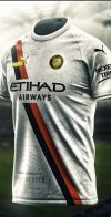
What colour is the second kit, Cream or White?Home kit is a beauty however would be infinitely better with white socks with blue trim
What colour is the second kit, Cream or White?Home kit is a beauty however would be infinitely better with white socks with blue trim
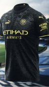
Hate itNo, the other image, it's the left one. Dark Blue and Red.
Looks cream. It has like faded patches also to represent Manchester industry or somethingWhat colour is the second kit, Cream or White?
No idea if that away one is real but, sue me, it’s a beauty.
They are not paying us to sell their kits, they’re paying us to have their logo on our kits and on the stadium and on the seats so that it gets them a nice box at the Etihad, nice trips to Abu Dhabi and gets Puma seen around the world when we play, getting their merch - City related or not - sold as they’re seen being part of a big successful business like City.It doesn't when Puma are paying £70 million a year to sell them.
It looks alright doesn’t it? I like where the badge is much more.Im gonna put it out there… i prefer next seasons home to this ones.
Fuck me, the charges must be sticking. Are we playing in the National League or something next season?Yep does look like those are the kits. Those fellas on dhgate usually get it right tooView attachment 75523
I darent say what you just said as i knew it would go against the majority. I loved it when it first came out but i dont think its aged well.It looks alright doesn’t it? I like where the badge is much more.
I must say that I loved this season’s kit when I first saw it but I’ve liked it less and less as the season has gone on and find the badge in the middle makes the kit look a bit odd and I prefer the badge on the left and the Puma logo on the right (as you wear it, not as you look at it).
I used to play on the rugby league team at Padgate Campus in Warrington. We were a small campus but we were in the top division in the country playing against the likes of Loughborough.Another thing, youre being a but disingenuous to serious players like dias and rodri if you think the kit will affect performance
Im gonna put it out there… i prefer next seasons home to this ones.
Agreed -as a FOC I’ve always associated the Badge in the middle with the old Warsaw Pact Countries (were it looked fittingly odd)It looks alright doesn’t it? I like where the badge is much more.
I must say that I loved this season’s kit when I first saw it but I’ve liked it less and less as the season has gone on and find the badge in the middle makes the kit look a bit odd and I prefer the badge on the left and the Puma logo on the right (as you wear it, not as you look at it).
Agree 100% -they look BrilliantPuma could do a lot worse, than hiring this kid off Twitter. Some of his designs are absolutely phenomenal. These two containing old maps of Manchester, are pure filth.
I played football at a decent level and one team i played for had red shirts and white shorts (i know … dont).I used to play on the rugby league team at Padgate Campus in Warrington. We were a small campus but we were in the top division in the country playing against the likes of Loughborough.
Our kit was shit when I first got there. We didn’t like it and we didn’t like playing in it. We got in touch with Warrington Wolves and they agreed to give us a batch of their last season’s kits each season. We were waking out away at Loughborough, Leicester, Leeds and Manchester wearing better kits than them and we felt pride in doing so.
RagI played football at a decent level and one team i played for had red shirts and white socks (i know … dont).
I still played out my skin.
Red badge, we should never have a red fucking badgeI think the 3rd kit is the best of the 3.
Wouldnt normally like the lines all over it but think it works pretty well.
Home and away are both shit.
You mean the iconic champions league final winning kit?That lightning kit isn't great but its infinitely better than the weird yellow/green thing we have this year
Looks cream. It has like faded patches also to represent jizz from powerwanks during a city game.