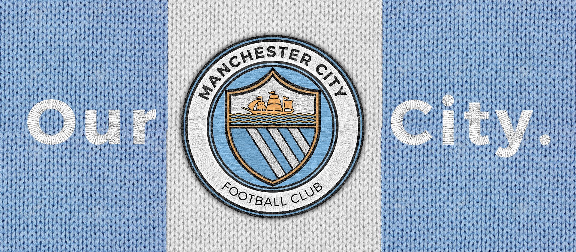
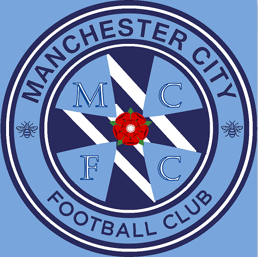
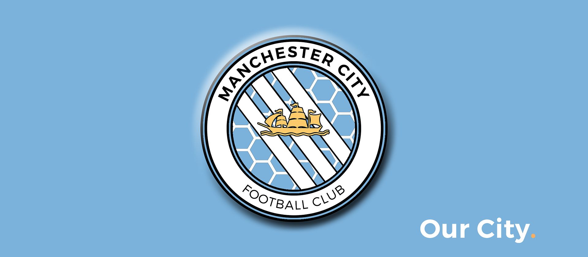
Nice to see so much enthusiasm on here for the badge debate but please don't forget to do the official mcfc consultation stuff as well. Remember that colours, shapes and every aspect is worth thinking about - never forget that mufc dropped football club, arsenals cannon turned around and Everton, well Everton messed everything up as far as fans were concerned. This is a great opportunity. Also, don't forget I'm doing some lectures on the badge over the next few weeks. Book on and I'll go through the history of the badges and their elements. There'll also be an opportunity for questions about the badges histories, do if you've wondered about the significance of any element, ownership of rights or whatever then come along and I'll do my best to explain or answer the questions. Cheers