You are using an out of date browser. It may not display this or other websites correctly.
You should upgrade or use an alternative browser.
You should upgrade or use an alternative browser.
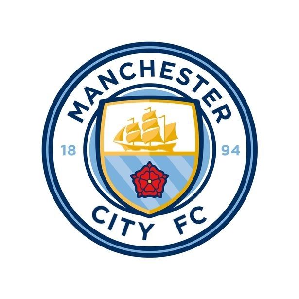
Club Badge (merged)
- Thread starter MCRJON
- Start date
blingy
Well-Known Member
I don't like it but I'm laughing my cock off at all the eagle outers who don't like it ,,,
all those making the big noise who wanted the big change, no eagle on my crest Lol
Be carful what you wish for you just may get it ...
In fact reading your displeasure at it is the only shining light in tho whole situation ...
Eagle inside the round not looking to bad now is it ...
Lol
Merry Christmas to all you blues and peace to all man kind
Except the designer team and eagle outers
There just dicks
BenjaniMwaruwari
Well-Known Member
- Joined
- 13 Aug 2015
- Messages
- 564
Side by side comparison really does show how shit our current badge is

kippaxkid74
Well-Known Member
- Joined
- 5 Jun 2009
- Messages
- 1,833
This would be better - and make the shield triple topped.. but thay're not going to change that now :(
Best we can hope for is a change of the writing to include FC.
Apologies for my poor photoshop skills btw! (only did it quickly)
Black Text:
Think it looks too cluttered with the full "football club" bit, better with fc but just my opinion! Looks better in black though as you say.
For me the problems are the flat text and the shading. I'm not too keen on the shield popping out either, I would've preferred it if it was more like this.

Absolutely perfect, just needs the 1894.
Before I sign off for Xmas, I pass on my modest legal view with some asthetic considerations thrown in.
1. FC - 'Manchester City' cannot be confused with any other organisation. hence why the Rags have ditched it.
2. Words - the Manchester at the top is emphatic and the City stands alone. We are often now called this around the world. I heard Ranieri call us 'City' the other day and so there you go. Not a bad thing, in my view.
3. 1894 - Again, resonates around the world. The dippers use their 1892 ad nauseum. Whilst our heritage is obvious to us, that's unlikely to be the case in, say, China, but where history and continuity are highly valued assets. If only our @Gary James has the opportunity to educate the British Media away from their 1992 obsession.
4. Colours - Multicolours will go down well with most. With respect, us moaners are a rather conservative lot. Out in the world of punters, they like bling. Is one colour Gold? It will shine under lights. The red also stands out and gives the badge individuality. As a born and bred Mancunian, I find being told that I am not from Lancashire very insulting. Others don't mind, obviously. Furthermore, I don't know but guess that there are spot colours being used [as opposed to standard pantones]. This makes copying both more difficult and more expensive.
5. Design - The circle is tidy and confident looking, much like Chelsea's, for example. I'd say that the overlapping shield also provides further protection against copying. Of course, someone will have a go but they will never get the colour and design exactly right.
Overall, it makes sense to me. I worked with the IPOs 20 years ago, They are probably the best in Manchester and so no surprise the club have engaged them. If you get the chance, read the classes that the trade marks are being applied for. The mind boggles. Onwards and upwards.
Merry Christmas from a wet and windy Manchester. Peace, Love and Freedom for all.
Manchester_lalala
Well-Known Member
Huge upgrade on our current badge.
blingy
Well-Known Member
Should have gone to specs savers m8 but each to there own I suppose ...Side by side comparison really does show how shit our current badge is
I'd expect to see the leaked badge on the junier citizens porthole not as a representation of a global business targeting adults
Citizen of Legoland
Well-Known Member
- Joined
- 15 Jan 2013
- Messages
- 11,953
Not necessarily, there are some elements in the composition which go against general modern design techniques, the straight text of City against the curved Manchester being one, the complementary tones for the ship and rivers may reproduce poorly in print and fabrics, the blue\red colours clash even when changing the blue tint stripes to white. And in my eye there is too much white space behind the ship.So what is this execution please? Surely these 3 mid to high level designers are only voicing their personal opinion. As we all are on here.
Cheadle_hulmeBlue
Well-Known Member
- Joined
- 27 Oct 2012
- Messages
- 19,267
Honestly mate, I wasn't being a dick so apologies if that's how it came across.
I've tried to explain to another poster earlier in the thread why it looks cartoonish and it's not easy to explain. I just look at it straight away and think cartoon, a few people I showed it to said exactly the same thing. You and others can't see it.
I think the shield popping out of the circle looks like something on a Warner Bros cartoon. I guess the huge text and loads of white space makes it look like it was made for toddlers as well. Also the shield being bevelled at the top, the top half of the shield with the boat being bigger than the bottom half with the rose makes it look like it's popping out of the shield, the designer would probably call it "dynamic". These things aren't standard in traditional badge design, they are features you would usually see in a cartoon drawing.
The colours used almost look a bit primary coloured which also makes it look like it is for toddlers.
All of these things might not mean anything to you, it's in the eye of the beholder. I don't know anything about fine art, someone could explain to me why the mona lisa is a masterpiece, but I don't see what they see, and no amount of explanation will make me see it through their eyes.
If you don't see it as cartoonish, no amount of explaining will make you see it through other people's eyes. But some people do see it as cartoonish, not saying their opinions are any better or worse than yours, people just interpret things differently.
not its fine mate :) i get what you mean. was just interested to see why you it looked cartoonish. I can see it a little bit.
IanBishopsHaircut
Well-Known Member
Side by side comparison really does show how shit our current badge is
Agreed..fucking hate that Eagle..alway s have done..could have been replaced by anything and i'd be happy..just so happens the new badge is an acceptable take on our old one
I don't think anyone thinks it's the best it could have been..Gav's designs were spectacularly good..so the club were always on a hiding to nothing
BenjaniMwaruwari
Well-Known Member
- Joined
- 13 Aug 2015
- Messages
- 564
It's not targeting Adults though, it's targeting everybody, and even then there are quite a lot of adults that like the badge. People will like it, people will dislike it. Not everybody will be on the same boat.Should have gone to specs savers m8 but each to there own I suppose ...
I'd expect to see the leaked badge on the junier citizens porthole not as a representation of a global business targeting adults
Higor Douglas
Well-Known Member
- Joined
- 13 Jul 2015
- Messages
- 592
Another version by me

blueheart84
Well-Known Member
Well it's round and the font will probably age better than the one on our new badge...This one could work

Higor Douglas
Well-Known Member
- Joined
- 13 Jul 2015
- Messages
- 592

Gary James
Well-Known Member
1880 or 1894 the facts: over the last 24 hours I've seen lots of comments about the formation date of Manchester City and so, to ensure everyone's aware, I thought I'd add my comments here. If you attended my badge talks or have read my books you'll know this anyway, but if not here goes....
Manchester City was established in 1894, April to be more precise, and was described as a new football club for Manchester at its birth. Josh Parlby, a prime mover, eloquently talked of the new club at the May 1894 League AGM where he stressed that MCFC was not Ardwick in disguise. In fact Ardwick played on after MCFC was founded and so the two organisations were in existence at the same time. Ultimately, Ardwick gave up and most - but not all - connected with Ardwick joined MCFC.
So Manchester City was a new team, formed in 1894. This however does not mean that everything that came before 1894 is irrelevant, far from it, but it does mean that Manchester City's formation is 1894.
Some people say 1880 should be the club's formation, but we have no idea whether 1880 was actually the year the football club came into existence. We know they played games in 1880, but it's possible they played games before1880 that weren't reported. By comparison MUFC claim 1878 as formation, but there's no evidence of Newton Heath playing football before 1880, so what were they doing before 1880? And how does this compare to St Mark's? We know there were regular cricket games at St Marks in the 1870s and before, should that be included? There were even cricket matches in the 1860s, so what should we do?
City fans have often said that MUFC's formation should be 1902 and that's true, because Newton Heath was the club before 1902, so City should ensure their date is accurate. 1894 is exactly right - it's the year MCFC was formed. City use authentic dates, others have no evidence for theirs!
For more on 1894 read the Look Inside stuff from 1894 on Amazon for my book Manchester a The City Years (that section's free!)
Amazon product ASIN B00M74AHNW
Cheadle_hulmeBlue
Well-Known Member
- Joined
- 27 Oct 2012
- Messages
- 19,267
Another version by me
that looks more balanced to me, but i think it needs the rose on it.
Champions2012!
Well-Known Member

I am loathed to say it but I went over to the darkside of sad cafe to see if they are taking the piss and they are all praising it as stylish urrgh! anyway someone had mocked this up and I feel dirty even posting something fruom there but
fuck me that looks way better
Shaelumstash
Well-Known Member
- Joined
- 30 Apr 2009
- Messages
- 8,305
I don't like it but I'm laughing my cock off at all the eagle outers who don't like it ,,,
all those making the big noise who wanted the big change, no eagle on my crest Lol
Be carful what you wish for you just may get it ...
In fact reading your displeasure at it is the only shining light in tho whole situation ...
Eagle inside the round not looking to bad now is it ...
Lol
Merry Christmas to all you blues and peace to all man kind
Except the designer team and eagle outers
There just dicks
I was an eagle outer and this design looks a bit cartoonish for my tastes.
However, I'd prefer a round badge with the ship and rivers / rose designed by someone at Warner Bros than Leonardo DaVinci coming back down to earth to produce anything with an eagle on it.
Was convinced the eagle was going, and I'm absolutely delighted it is, never to come back.
Merry xmas.
kippaxkid74
Well-Known Member
- Joined
- 5 Jun 2009
- Messages
- 1,833
ok i know this thread is so big that people seem to only read the most recent page then post... but how about opinion on these 3?!
Cos it seems this is the badge, and any whining isn't going to change it - we can only hope for tiny changes, such as writing, or shading..
So which is best, i think middle one (and not just cos i changed it!), left looks too empty, right too full.
Any takers?!
Cos it seems this is the badge, and any whining isn't going to change it - we can only hope for tiny changes, such as writing, or shading..
So which is best, i think middle one (and not just cos i changed it!), left looks too empty, right too full.
Any takers?!