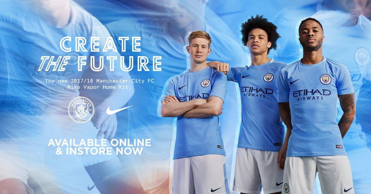
The black nike and etihad logos annoy me. Just stick to white and blue
Apparently Etihad want their logo in a darker colour, however I do think the Nike swoosh would look better in white, as on the Melbourne kit/
The black nike and etihad logos annoy me. Just stick to white and blue
They must pay some **** to sit in front of a computer for 30 minutes to design a generic template kit who then emails it to their marketing department who colour and badge it according to which team it's for then charge nearly a ton per 'Match ready' shirt.
What an easy way torip offmake lots of money.
White logos look awful on a pale colour.Black (or very dark blue) stands out far better and can be seen more clearly,especially as our sponsors are looking for maximum advertising on tv.The black nike and etihad logos annoy me. Just stick to white and blue
White logos look awful on a pale colour.Black (or very dark blue) stands out far better and can be seen more clearly,especially as our sponsors are looking for maximum advertising on tv.
10 years? They're on their last season now and I hope they're fucked off. If they had any intention of keeping us they should have renegotiated the deal years ago - it's ridiculously undervalued.Was it that hard Nike?!?! Can we just keep this for the next 10 years please?
How about B***ARDO, just to keep people guessing?
I'd say he had fun on the first day of school.Would be a weird choice to go with a baseball player
http://m.mlb.com/player/455374/antonio-bastardo


