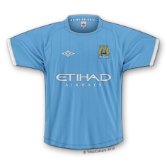
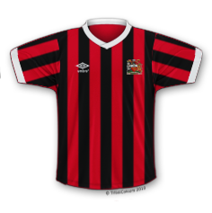
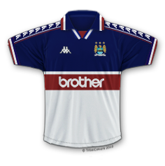
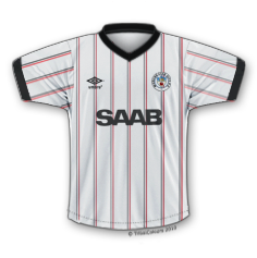
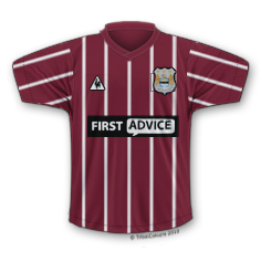
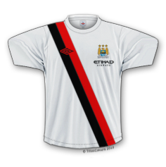
City’s New Kits - 2020/21 - [Old Thread]

Is the sponsorship black or navy? I’m not a fan of it on first viewing.

In fact most of Puma’s efforts in this first year have been subpar, the training is gear is atrocious on our website for example.

I really wish we were with Adidas, some of the original gear they could do for us would be amazing
 
Presume its a clever pr campaign.......

Post pix of dreadful design knowing that fans will says its dogpoo

But be keeping the real humdinger design back so can say listened

to fans input and hey presto heres the real one....................................!


Anyway wheres 2m hoop element to keep players socially distanced?


If the writing were in white it would look much better

it does feel like we all complain about how poor the kits are each year but we eventually get used to it, maybe they should release every other season like it used to be - they'd actually have some time to think over a design!
 
If the writing were in white it would look much better

it does feel like we all complain about how poor the kits are each year but we eventually get used to it, maybe they should release every other season like it used to be - they'd actually have some time to think over a design!

well they're doing a competition at the moment, so I suspect they may use some of those entries as inspiration going forward.
 
If the writing were in white it would look much better

it does feel like we all complain about how poor the kits are each year but we eventually get used to it, maybe they should release every other season like it used to be - they'd actually have some time to think over a design!
It’s not really that important at the present time but it doesn’t look the best does it.
 

Don't have an account? Register now and see fewer ads!

SIGN UP
Back
Top
  AdBlock Detected
Bluemoon relies on advertising to pay our hosting fees. Please support the site by disabling your ad blocking software to help keep the forum sustainable. Thanks.