blueparrot
Well-Known Member
- Joined
- 7 Jun 2012
- Messages
- 33,397
They are taken months ago by people that don't have the faintest inkling of our transfer plans.No? Maybe not...
They are taken months ago by people that don't have the faintest inkling of our transfer plans.No? Maybe not...
They are taken months ago by people that don't have the faintest inkling of our transfer plans.
Definitely MaybeNo? Maybe not...
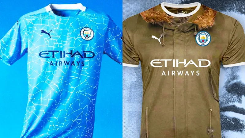
I'll be honest, modern football has brought lots of improvements to the game, but where it has failed totally is in its observance of club identity and specifically the colours and style of shirt a team plays in!
That latest offering is horrendous, just as many of those that have gone before, and I make my decision on all kits on whether I can imagine Mike Doyle wearing them with pride and an inflated chest. Simply put, I suspect he would have simply refused to even put it on in the first instance and would have punched any club employee who persisted that he should.
Agreed. I know I'm in the minority but I really like the new third kit, well I did until I saw the back. I think it is pretty much ruined by not having the paisley on the back. Just looks weird.Like the mosaic on the home kit I think both would look better with the pattern on the back as well.
Get a number on it looks much better imoAgreed. I know I'm in the minority but I really like the new third kit, well I did until I saw the back. I think it is pretty much ruined by not having the paisley on the back. Just looks weird.
Very very very disappointed with Puma so far except for the 125 anniversary top.
Couldn't agree more. I've not bought a shirt since these hooligans took over
Very very very disappointed with Puma so far except for the 125 anniversary top.
You’re serious? I think Puma has done a great job. The away and third kit looks awesome. The home kit though is a bit tricky to make interesting. But Nike just made them all plain and boring. At least Puma make an effort.
 www.joe.co.uk